 |
|
 |
|
|
|
|
 |
 |
 |
 |
 |
 |
 |
|
|
|
|
 |
 |
 |
 |
 |
 |
 |
|
 |
 |
 |
 |
 |
 |
 |
|
|
|
 |
 |
 |
 |
|
|
|
|
The text face used here (as well as elsewhere) is Broadsheet™. The home page letters are set in Emily Austin™ & Lamar Pen™. All typefaces referenced on this website— Abigail Adams™, American Scribe™, Antiquarian™, Antiquarian Scribe™, Attic Antique™, Austin Pen™, Bonhomme Richard™, Bonsai™, Botanical Scribe™, Broadsheet™, Castine™, Douglass Pen™, Emily Austin™, Geographica™, Geographica Hand™, Geographica Script™, Houston Pen™, Lamar Pen™, Military Scribe™, Old Man Eloquent™, Remsen Script™, Schooner Script™, Terra Ignota™ & Texas Hero™ (as well as all other fonts in the Handwritten History™ Bundle)—are the intellectual property of Three Islands Press (copyright ©1994–2015). For site licensing contact: Three Islands Press P.O. Box 1092 Rockport ME 04856 USA (207) 596-6768 info@oldfonts.com |
|
|
|
|
 |
|
|
|
|
 |
|
|
Posts Tagged ‘old handwriting’
Wednesday, July 22nd, 2015
 Military Scribe. Historians solve puzzles by reading multiple clues. Their job is to interpret information gleaned from manifold sources—archaeological discoveries, ancient books, newspaper archives, boring old handwritten records—and come up with as accurate a narrative as they can of a particular time, place, event.
Sounds like a rather dry, academic pursuit—but is it really?
Heck, my devoted ma spent time as a historical librarian—and even I have only yet begun to appreciate the allure. Turns out those old handwritten records aren’t as boring as they might first appear.
Take my latest historical typeface, just released—a font I call Military Scribe. The inspiration came from a group of digitized military records from the 1770s sent to me by a friend and correspondent: muster rolls of the Tenth Regiment of Foot, a unit of British soldiers who fought on American soil in the early days of the Revolutionary War.
 Compact, legible script. Muster rolls. Lists of names of Englishmen, surrounded by dates and contractual boilerplate. Routine records written at a desk in an office somewhere by obscure military clerks who knew how to wield a pen.
I had about fifty pages to work with, spanning 1774 to 1779 and drafted by at least three or four different scribes. Right away I decided to concentrate on the work of one penman in particular—a clerk from the earlier part of the period with a particularly legible, compact hand—with some help from the script of another who wrote with a little more flair. The former seemed to take his job seriously, wrote legibly while cramming a lot in; the latter I took for a bit of a dandy, someone who might’ve stopped to admire what he’d written.
 Fancier script. What I do involves looking very closely at strokes and curves and shapes while also contemplating things at arm’s length. Mired in this kind of study, I can’t help but get a feel for the personalities of these people. And then the mind plays a sort of trick, and the years sort of slough away, and “history” starts to seem like a year or two ago.
First are the names of the men of the Tenth of Foot. A few sound old and peculiar, like Bartholomew Haycock or a soldier named William Frapwell, but I think I met Frank Cooper and John Marshall at a party. Then come the verbs that appear next to the names—“transferred,” “discharged,” “sick,” “deserted,” “died.” You start to get a feel for the time and place and people.
 18th century dittos. Invariably you learn things. From the rosters of the Tenth of Foot I found out that the British spelling of sergeant was “serjeant” until about a half-century ago. I also learned that, in handwritten history, the term “ditto” was as serviceable 240 years ago as it is today—and that “do” was an acceptable abbreviation. In fact, I learned so many new abbreviations for names that I included a few in the font.
But one name in particular caught my eye, a captain named Mundy Pole. I’d never heard the name before and had to make sure I was reading it right and googled the fellow—and come to find out he played a role in the famous events of April 1775 in and around Concord, Massachusetts.
 Mention of Capt. Mundy Pole. “Captain Mundy Pole of the Tenth Regiment with one hundred men had been detailed by Lieut.-Col. Smith for guard duty at the South Bridge. He was also instructed to destroy any public stores that he might find in that vinicity.” —The Battle of April 19 1775, by Frank Warren Coburn (1912)
[My listing of Capt. Pole is from later that year.]
And this discovery got me researching other old accounts of the Battles of Lexington and Concord—one of the most interesting coming in the latter pages of the Massachusetts Historical Society’s copy of General Gage’s Instructions of 22d February 1775. Captain Pole is mentioned there, too. Check it out.
Historical re-enactors still faithfully recreate this expedition of the Tenth of Foot—the grenadiers and light infantry units who were among the first to come face to face with the “rebel” militias and Minutemen of inland Massachusetts, scene of Emerson’s “shot heard round the world.”
But no one writes muster rolls by hand anymore, I’m pretty sure.
Miscellanea
» Beautiful old love letters in a box.
» Century-old chalkboards found preserved in Oklahoma.
» The power of a handwritten letter from Dad.
» New pen designs are still a thing.
 Military Scribe font
Tags: Battles of Lexington and Concord, British soldiers, disconnected cursive, handwritten history, historical documents, historical reenactment, muster rolls, old handwriting, Revolutionary War, Tenth Regiment of Foot, vintage penmanship
Posted in Historical Figures, History, Paleography, Penmanship, Ruminations, Specimens | No Comments »
Sunday, September 14th, 2014
Sharing your handwriting with others is a way of sharing part of yourself.
When I read that sentence—written by Gina Logue, a columnist with The Murfreesboro Post, in a piece today on Tennessee’s return to teaching cursive handwriting to grade-schoolers—I found myself smiling in agreement. No keyboarded words will ever compare to those applied with pen to paper.
My mother died eight years ago, but whenever I come across her handwritten words on a note or an envelope or the back of an old photo, her face springs at once to mind. How instantly we recognize the penmanship of a loved one, its size and slant, those familiar quirks and curls.
And without even thinking we catch more subtle signs that add depth and context to the message. The pressure of the pen. A hurried look. Unusual neatness. A pause to reflect.
 A page from Douglass’s lecture on John Brown and Harper’s Ferry. (Click any image for larger view.) Handwritten words, transcending time, move directly from mind to pen to mind.
This idea got me thinking of the many penned words left us by Frederick Douglass, the nineteenth-century American abolitionist and orator. I modeled a font after Douglass’s compact, legible script—Douglass Pen, it’s called—and in the process, more than a century on, he managed to change my mind.
Specifically, Douglass changed my mind about John Brown.
From what I’d learned in school in the 1960s, Brown’s 1859 raid on Harper’s Ferry was the equivalent of domestic terrorism. That his abolitionists crept in by night and killed innocent people in a crazy scheme that was sure to fail. That Brown himself was a wild-eyed crazy man.
But when I read, in his handwritten words, what Douglass had argued so eloquently—that Brown, whom he knew, was an idealistic hero who gave his life for the cause of freedom—I began to research further.
 Letter to Hugh Auld (The Gilder Lehrman Collection on deposit at the Pierpont Morgan Library.) Turns out Henry David Thoreau, too, knew and supported Brown. And most modern historians are gentler on his reputation than those of the twentieth century. Most credit his Harper’s Ferry raid with hastening civil war and the death of slavery—his mission all along.
Still, it was Douglass’s neat, true penmanship in a draft of a Harper’s Ferry lecture that proved, to me, most convincing.
Though fourteen years have passed between us and the tragedy that closed his life, we may yet stand too near to his life and times—to properly weigh and measure the man, or to set a just value upon what he did and attempted in the world. Like the great and good of all the ages the men born in advance of their times—and whose blood stained footprints attest the immense cost of reform, and show us the slow pace of human progress, our grandest American hero and martyr, may have to await the pollishing [sic] wheels of after coming centuries, to give to his great qualities and deeds full effect and glory!
I’ve also got a copy of a letter Frederick Douglass addressed to one of his owners when he was a slave, written two decades after he’d run away. A polite, respectful, forgiving letter, written in 1857. He used one page of lined paper. You could see the care he’d taken in the composition. “I love you,” he wrote, “but hate slavery.”
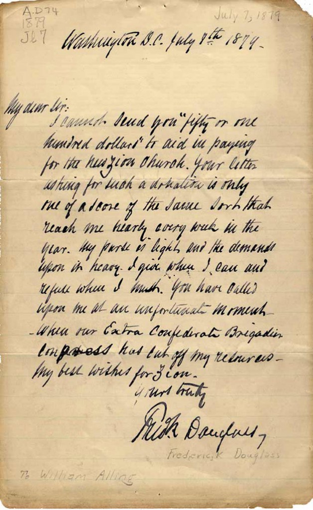 Douglass letter to Zion Church. And another note, a reply to a letter asking for money to help build a church, includes pithy sentences that communicate a lot. “My purse is light,” he wrote, “and the demands upon it heavy. I give when I can and refuse when I must.” The man had a classic orator’s way with words.
In working so many long hours recreating Douglass’s penmanship, I’ve come to be able to recognize his hand. As I do my parents’—or past loves who broke my heart.
A lot more gets said through handwriting than merely words.
* * *
Recent links…
» LOGUE: Tennessee putting cursive back in handwriting in 2015—The Murfreesboro Post
» Pens for Better Penmanship: Don’t Forget (How) to Write!—The Wall Street Journal
» In The Age of Keyboards, Don’t Neglect Your Penmanship—Big Think
» Handwriting reveals kids’ inner anxiety—The Times of India
Tags: antique penmanship, art of handwriting, Douglass Pen font, Frederick Douglass, Henry David Thoreau, old handwriting
Posted in Cursive, Education, Historical Figures, Old Letters, Penmanship, Ruminations, Specimens | No Comments »
Thursday, August 14th, 2014
 A letter written in 1851 by Emily Austin Perry, who never wasted a margin. (Our Emily Austin font is modeled after her hand). I ride a lot of miles on my bicycle. Fact is, I’m kind of a bike-riding fool, pedaling up and down the wide shoulders of Route 1 here on the scenic coast of Maine. One recent year, I cycled more than 2,100 miles—and only hit the pavement once or twice. While on my bike the other day, I got to thinking about things I find on the side of the road, and for some reason I thought of the many old handwritten pages I read, and the kind of stuff I encounter in the margins.
Along my particular stretch of Route 1, the most common jetsam I come across (aside from run-of-the-mill litter) are single work gloves. Also surprisingly abundant are banana peels. I understand the lost work gloves—some landscaper or trap-hauler had left a pair on the bed-rail of some pickup—but banana peels?
It’s easier to explain the peripheral jots and tittles in the margins of old letters and journals.
Ink blots, for one thing. Back in the days of quills and fountain pens, when writing was a silent pursuit and ink was a sort of fuel, spillage was routine. Drips, smudges, purposeful dabbings. They’re common enough that I’ve made sure all our old handwriting fonts have ink-blot characters. (It’s fair to call me obsessed with authenticity.)
 Cross-outs and insertions in the journal of Mirabeau B. Lamar (inspiration for Lamar Pen). Random scribbles crop up regularly, too, where authors were testing their pens. (Heck, I do that still, when stuck with a recalcitrant ballpoint.) Occasionally I even come upon what look like true doodles, the work of a preoccupied mind.
And within the handwritten text itself are small signs of our propensity to edit: cross-outs and underscores, insertions of words and small phrases, notes in the margins. Word-insertions of two hundred years ago look identical to word-insertions of today—an angle pointer below the baseline at a space, the word writ small above the ascenders. Literally, you’re reading between the lines. We’ve included cross-out characters in many of our antique pen fonts, and several have insertion glyphs, as well.
 Smear, ink blots, and sealing-wax cutout from a letter by Abigail Adams (used to make Abigail Adams font). But perhaps most telling of the times—and something we can hardly imagine these days—is that the margins of old pages are often chock-full of real content. Back when paper was dear and delivery iffy, letter-writers made efficient use of the real estate. Emily Austin Perry, who wrote many letters home to Texas while traveling with her daughter up East, commonly crammed whole paragraphs around the edges, upside-down and sideways.
And if you go back a couple of centuries or more, before envelopes, you’re liable also to find evidence of sealing wax in the margins—perhaps some reddish discoloration, a tear or cutout, even a bit of wax itself.Back then correspondents would simply fold and seal the pages of their letters together.
 Inserted “h,” in a detail from a Colonial American broadside. (Source material for Remsen Script.) The leavings in the margins, I find, raise questions that launch trains-of-thought that give life to flickers of insight. Who lost that glove? Who threw that banana peel out the window? Does that smudge mean this letter-writer was left-handed? That faint, circular mark—could it have come from a tear?
Addendum
A little while ago, before publishing this entry, I took my daily bicycle ride and—I kid you not—came upon both a work glove and a banana peel along the shoulder of Route 1. As proof, I took these photos with my phone.
 Snap-on®  Banana peel
Tags: Abigail Adams, cross-outs, Emily Austin, ink blots, insertions, Lamar Pen, margins, old handwriting, Remsen Script, sealing wax
Posted in Old Letters, Penmanship, Ruminations, Specimens | No Comments »
|
|
|
|
|
|
|
|
|


