 |
|
 |
|
|
|
|
 |
 |
 |
 |
 |
 |
 |
|
|
|
|
 |
 |
 |
 |
 |
 |
 |
|
 |
 |
 |
 |
 |
 |
 |
|
|
|
 |
 |
 |
 |
|
|
|
|
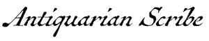
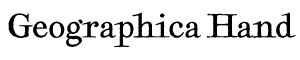
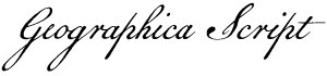
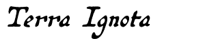
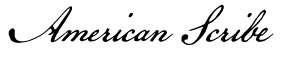
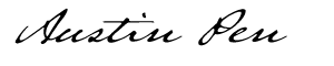
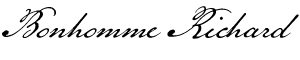
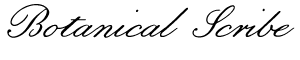
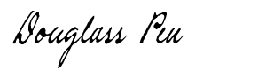
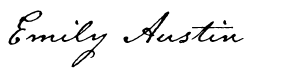
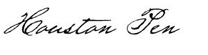
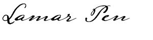
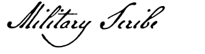
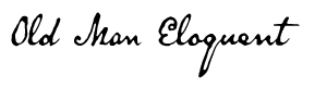
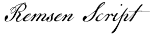
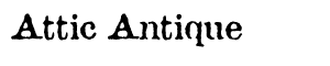
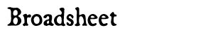
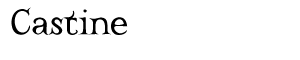
The text face used here (as well as elsewhere) is Broadsheet™. The home page letters are set in Emily Austin™ & Lamar Pen™. All typefaces referenced on this website— Abigail Adams™, American Scribe™, Antiquarian™, Antiquarian Scribe™, Attic Antique™, Austin Pen™, Bonhomme Richard™, Bonsai™, Botanical Scribe™, Broadsheet™, Castine™, Douglass Pen™, Emily Austin™, Geographica™, Geographica Hand™, Geographica Script™, Houston Pen™, Lamar Pen™, Military Scribe™, Old Man Eloquent™, Remsen Script™, Schooner Script™, Terra Ignota™ & Texas Hero™ (as well as all other fonts in the Handwritten History™ Bundle)—are the intellectual property of Three Islands Press (copyright ©1994–2015). For site licensing contact: Three Islands Press P.O. Box 1092 Rockport ME 04856 USA (207) 596-6768 info@oldfonts.com |
|
|
|
|
 |
|
|
|
|
 |
|
|
Archive for the ‘News’ Category
Tuesday, March 8th, 2016
 The Palmer Method of cursive script. I have my hand, and I have my pen. That’s it. —Rev. Robert Palladino
A few days ago I listened to a fascinating Freakonomics Radio podcast called Who Needs Handwriting? In exploring the question of its title, the episode features an interview with Anne Trubek (@atrubek on Twitter), a writer, editor, and former professor who knows a lot about writing by hand. Trubek, who is author of the forthcoming The History and Uncertain Future of Handwriting, essentially argues that kids don’t need to learn penmanship anymore.
It all started, Trubek says, when her son began having problems in second grade—strictly because of his poor handwriting skills. So she wrote an article for Good magazine with the bold and declarative title Stop Teaching Handwriting. It drew a lot of interest.
 The Gregg Method of shorthand. And she has a point: young people of today might well go far in our technology-driven world without so much as ever touching a pen. What use is it for us to continue to embrace what was originally a strictly utilitarian skill out of some romantic sense of self, a part of our individuality?
Then again, the Freakonomics podcast goes on to tell us, research shows that students who take notes by hand recall a lot more of a lecture than those who merely transcribe what’s said via keyboard. So should we perhaps be reviving shorthand (a skill my father practiced, much to my childhood incredulity and awe)? Not so much, turns out—it’s a lot closer to straight keyboarding.
Still and all, cursive script appears to be on the way out—other than as a fine art form. Fewer people over time will be able to read engrossed old documents. Who among us these days, after all, can interpret the early hand-scribblings of, say, a Sumerian skilled at cuneiform?
 Rev Robert J Palladino (at Reed College). On the other end of the handwriting spectrum, you have a celebrated scribe like Rev. Robert J. Palladino, who died a couple weeks ago. Palladino was a Trappist monk when he began learning the skills that made him a master calligrapher who, at Reed College, influenced Apple co-founder Steve Jobs’s design of the Macintosh computer. Jobs credited a Palladino calligraphy course he audited with helping inspire the whole idea of digital typography.
“[The Mac] was the first computer with beautiful typography. If I had never dropped in on that single course in college, the Mac would have never had multiple typefaces or proportionally spaced fonts.”
In a delicious twist of irony, of course, a master with a pen helped further our mass migration over to the keyboard. But there’s something to be said for Father Palladino’s own unwired life—replete with its long periods of thoughtful silence—and his having never once used a computer in 83 years.
[Hang on, time to check Facebook—brb.]
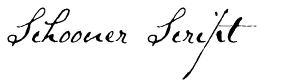
In keeping with my overarching theme here (i.e., handwriting as a sense of self), I’d like now to share another old handwritten document I’ve used as source material for a font I’ve designed. Below are page scans and a transcription of a two-and-a-half-page letter written 18 September 1825 by Samuel Clarke, then pastor of the Congregational Church of Princeton, Massachusetts, seeking donations for the victims of an accident at sea. Inspired by Clarke’s extremely distinctive penmanship, I designed Schooner Script back in 1996. [Note: the boat was in fact a sloop, but Sloop was a script already.]
 The Schooner Script letter, page 1. Princeton Sep. 18. 1825
Christian Brethren,
It is known probably to most of you, that several of our acquaintance and friends, in coming from the State of Maine to this Town, have been exposed to the most imminent danger, and also sustained a considerable loss of property. As their danger and misfortunes have excited much sympathy; and as it is believed to be a Christian duty to do something for their relief, it may be proper, for the correct information of all, to make a short statement of the peril to which they were exposed, and the extent of their loss.
On Saturday the 10. inst, at 12.o.clock, Messrs How, Fay and Cobb with the wives of the two last, and eight other persons, sailed from Camden for Boston in the Sloop Governor. Their passage was favourable until about 8.o.clock on Saturday evening, when the Sloop was struck by another vessel which was apparently in distress, and whose fate is not known. The Sloop was so much injured by the unknown vessel, that she very soon filled with water, which, communicating with lime in the hold, caused her to take fire. Being unable, by the greatest exertion, to save the Sloop, the Captain with his men and passengers was obliged to abandon her, and consign themselves to a small Boat only thirteen feet long and about five wide. our friends were compelled so hastily to leave the Sloop, that they had no time to secure their trunks and clothing—and had they been even able to do this, the smallness of the Boat to which they fled, would not have admitted any additional weight. In this small Boat thirteen feet long, thirteen persons
 The Schooner Script letter, page 2. passed the whole of Saturday night on a boisterous, dangerous sea, some of them destitute of outer garments, and all of them in constant danger of immediate death. It is impossible for us to know, much more to describe their anxiety, their anguish. But a benevolent and merciful Providence watched over, and preserved them, when death appeared inevitable. After having been in this dangerous, distressing situation nine hours, they were discovered on the morn of the Sabbath by another Sloop which immediately came to their relief, and rescued them from impending destruction. In this Sloop they arrived in Boston on Tuesday morning, and on Wednesday were permitted to rejoice in again beholding this their native Town, and receiving the kind welcome and sincere sympathy of their acquaintance and friends.
They desire, with unfeigned gratitude, publicly to acknowledge the goodness and mercy of God which watched over and saved them in the season of extreme peril, which preserved them from the watery element, and which has again restored them to the arms of their brethren and friends—
It may be proper to state that Messrs How and Fay saved their money, with the exception of a small sum lost by Mrs. Fay—but they lost a considerable amount of property in clothing. Our young friends Mr. and Mrs. Cobb lost nearly five hundred dollars, about four hundred of which was in money, and the rest in new and valuable clothing.
There can be no doubt, Brethren, respecting our duty in relation to the misfortune of our friends. While we sympathize with them, we should also assist them in bearing the burdens which a wise Providence has seen fit to lay upon them. It has been suggested by several respectable persons that the easiest and most effectual method of rendering them assistance, would be to request a contribution in each of the religious Societies in this Town on the
 The Schooner Script letter, page 3. next Sabbath. In accordance with this suggestion a contribution will be requested in this place in the afternoon of the next Sabbath, when it is hoped that our charity will correspond with our ability and the necessities of our friends, and manifest for us that we do truly sympathize with them in their sufferings, rejoice in their preservation, and are anxious for their future comfort and happiness—
Samuel Clarke
Pastor of the Congregational Church
in Princeton—
Miscellanea
» Lamentations continue over the decline of cursive—from pen companies, forensic scientists, and autograph collectors.
» Does playing with old-fashioned toys help kids learn better handwriting skills?
» Handwriting analysts go to town on a note left by a guy who found a wallet full of stuff—but didn’t return it all.
» It might be fading generally, but certain local school districts continue to find time for handwriting instruction.
» A thoughtful essay by Dolly Merritt about what penmanship used to mean.
Tags: Anne Trubek, calligraphy, common core, engrossed documents, Freakonomics podcast, Gregg shorthand, handwriting in schools, old handwriting, old handwriting fonts, penmanship as expression, Robert J Palladino, Schooner Script, sense of self, Steve Jobs, the palmer method, vintage penmanship
Posted in Cursive, Education, Graphology, Historical Figures, History, News, Old Letters, Penmanship, Science, Specimens, Uncategorized | No Comments »
Saturday, January 23rd, 2016
 John Hancock Today, here in the U. S. of A., some celebrate National Handwriting Day.
The first National Handwriting Day happened in 1977, thanks to some folks with a stake in the practice—the Writing Instrument Manufacturers Association—who decided to celebrate penmanship on the 240th birthday of John Hancock, famed signatory of the Declaration of Independence. Not a bad idea.
In the four decades since, of course, a plethora of keyboards and smartphones and tablets has rendered penmanship more of a hobbyist’s pursuit. Not unlike taking pictures with now-old-fashioned film cameras. People don’t practice it, schools don’t teach it, and kids wouldn’t know how to decipher cursive script if their lives depended on it. Never mind that it’s actually good for you.
Even yours truly, who has black ballpoints scattered handily around the house on nearly every desk and table, rarely writes more than to-do lists these days. Some Antique Penman I am.
 John Hancock’s penmanship And guess what? It turns out laments over the lost art of handwriting are nothing new. As a TIME article yesterday by Lily Rothman points out, teachers of penmanship deplored the death of fine pen strokes way back in 1935, more than forty years before the first National Handwriting Day. The trend toward bad handwriting also made the news in 1947, again in the early ’50s, and throughout the ’60s and ’70s. But most of that 20th century hue and cry came over the death of good handwriting—not the extinction of any kind of handwriting at all.
As I’ve opined here before, it’s not the beauty of the script that most counts—it’s its far less critical, less tangible qualities. Its heaviness or airiness, its intricacy or loopiness or slant. What it says about the writer. Its familiarity to someone.
Emanuella Grinberg, writing today for CNN, outlines studies that show how learning—and practicing—handwriting benefits the mind and body, not only for children but for grown-ups like you and me. It seems printing and longhand even exercise different areas of the brain. Grinberg also observes:
While we’re not aware of scientific evidence supporting the warm feeling of receiving a handwritten thank you card or love letter, anecdotal evidence suggests there’s something there.
 My dad writes home from basic training Now, see, this is what I’m talking about.
Think of the subtle, complex, even visceral effect you get when first viewing a note card or sheet of stationery that someone far away has held, and has written on, has strung together words that communicate sentiments meant only and particularly for you. Think also of the secret knowledge on the part of the note- or letter-writer of how what they write will affect their distant pen pal. Think, too—maybe especially, in this word of instant communication—of the span of time between the writing and the reading.
In a piece today for International Business Times, William Watkinson lists a few examples of what handwriting says about a person: heavy vs. light pressure, the shapes and sizes of letters, their wide or narrow spacing. In the process of developing my historical pen fonts, I’ve read so many letters of well-known historical figures that I’ve seen a lot of these graphological clues—e.g., the large, airy penmanship of Sam Houston, the fancy script of Mirabeau B. Lamar, the scrawl of Emily Austin Perry. I’ve studied ink blots and cross-outs and what I’m convinced are the marks of tear drops.
 Sam Houston writes to Chief John Linney But what I cannot do is divine how it felt for the recipients of these missives to read their authors’ handwritten words. Recipients like Shawnee Chief John Linney. Or the husband of Emily Perry.
There’s a distinct difference between reading a novel on a tablet screen and reading a perfect-bound book. I’d argue there’s even a greater difference between reading a handwritten note left hours or days before and an email message sent thirty seconds ago. A difference—a warm feeling—that’s akin to magic.
Miscellanea
» Um, contrariwise, here’s a robotic handwriting service—which is not exactly what I’m talking about.
[30 Oct 2019 update: The original link went dead, so I’ve inserted a link to another such service.]
» Ever hear of “penmanship porn”? (It’s actually kind of cool.)
» Australian parents emphasize handwriting.
» A century-old box in the cornerstone of a Kansas City school reveals penmanship of bygone days.
Tags: benefits of handwriting, cursive script, Emily Austin, Emily Austin Perry, handwriting analysis, handwritten communication, handwritten letters, historical letters, Houston Pen, Lamar Pen, Mirabeau B Lamar, National Handwriting Day, penmanship and the brain, Sam Houston
Posted in Cursive, Education, Graphology, Historical Figures, History, News, Old Letters, Penmanship, Ruminations, Science, Uncategorized | No Comments »
Monday, December 21st, 2015

Recently I stumbled upon Snail Mail My Email, the website for artist Ivan Cash’s online community art project whereby hundreds of volunteers transcribe the email messages of strangers into handwritten letters, which then get dropped in the mail. A novel, fun-sounding idea, to be sure—especially once you realize that most of the letters get the sort of eye-catching embellishments you might find on a greeting card. But what struck me first was its slugline: “Handwritten Letters in a Digital World.”
The idea left me, confusingly, both encouraged and aghast.
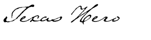
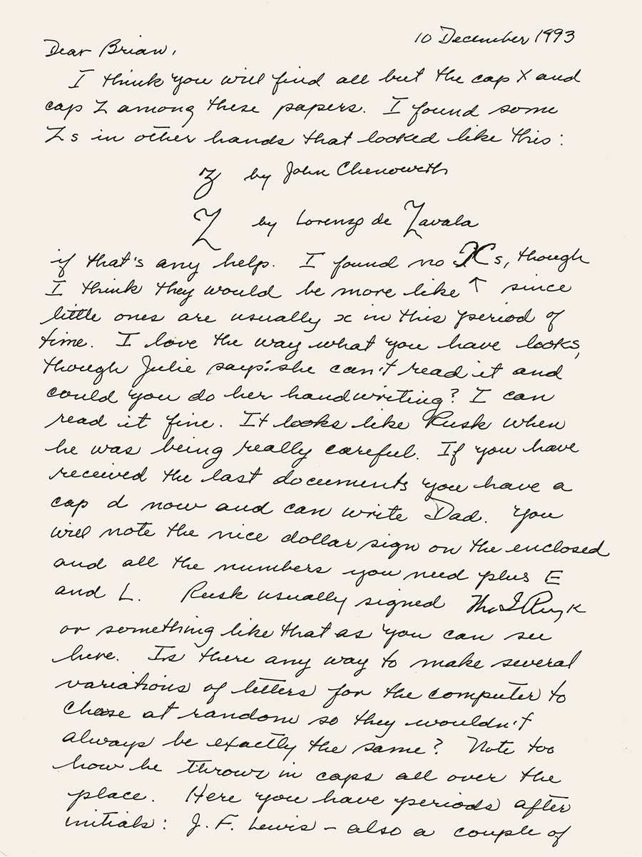 My mother helped with Texas Hero. Granted, there’s no little irony in the fact that I’m batting out these very words on the keyboard of a MacBook Pro—let alone the fact that I rarely ever send a handwritten letter these days. But if you’re a sighted person of a certain age, you’re sure to hold fast in your memory a small library of familiar handwriting samples.
Off the top of my head I can think of at least a dozen people whose penmanship I’d recognize in an instant: my parents, my siblings, my daughter, a grandfather and an aunt, two ex-wives, a couple old coworkers, a few good friends. And that’s not even counting more than a dozen others whose handwriting I’ve preserved in digital form—e.g., Abigail, Viktorie, and Marydale.
But what do you get when you open a letter in a stranger’s handwriting? There’s no flash of recognition at first glance at the hand-addressed envelope. No flutter in your gut as a face comes to mind. No proof that someone known and loved has reached out to you.
 Envelope from my father as a young man. It’s an art project, I get it. But the encounter reminded me that no more will I see envelopes freshly addressed by certain familiar pens—that of my dear mother, for instance, not even in her jiggly, Parkinson’s-induced scrawl. I can at least still revisit scores of her letters I’ve got in safe keeping. Although the flash of recognition lacks fresh brightness, it’s the work of her hand.
The power of familiar script is described with particular poignancy by Virginia resident Elsa Ann Heller, who was surprised to recognize her grandmother’s handwriting on a seventy-year-old postcard decorating a local restaurant:
“I know that sounds pretty old-fashioned, but that is how I know her. Her handwriting is written on my heart.”
 Ornament from Geographica, coming soon. Then again I’m not the only one who’s neglected his penmanship lately. Some time after Heather du Plessis-Allan, a presenter with a New Zealand current affairs TV show, broke a story exposing a loophole that let her buy a gun online without a permit, police showed up with a search warrant looking for handwriting samples. In the wake of the search—which suggests whoever ordered the gun might face punishment for breaking the law—she realized she barely handwrites anything anymore.
“Nowadays, everything is done on my laptop, tablet or cellphone. Even the grocery list. I email that to myself on the way to the supermarket.”
 Detail of S. F. Austin’s journal. Me, meantime? Well, I’m currently working on my first modern serif typeface ever—although it’s based on historical materials. In particular, I’m consulting the maps published by eighteenth-century English engraver Thomas Jefferys, known at the time as the “Geographer for King George III.” The neat lettering on Jefferys’s maps inspired me to give real type design a go for once.
But never fear, because after I finish Geographica, I’ll be making another old penmanship font modeled after the hand of Texas pioneer Stephen F. Austin (in his journal from a Mexican prison, circa 1834–35). And after that I’ve got a pretty cool modern handwriting font planned. Stay tuned!
Miscellanea
» It seems letter-writing clubs are a thing, and the Wonder Fair Letter Writing Club looks like a good one.
» A frightening prospect: machines have been passing the Turing Test—of handwriting.
» An art exhibit called “Good Penmanship” bids penmanship adieu.
Tags: Abigail Adams, art of handwriting, cartographic font, cursive writing, familiar handwriting, family, Geographica font, handwritten letters, letter writing clubs, Marydale font, nostalgia, old maps, penmanship, snailmail, Stephen F Austin, Thomas Jefferys, Viktorie font
Posted in Cursive, News, Old Letters, Penmanship, Ruminations, Specimens | No Comments »
|
|
|
|
|
|
|
|
|


