 |
 |
 |
 |
|
|
 |
 |
 |
 |
 |
 |
 |
 |
 |
|
|
 |
 |
 |
 |
 |
 |
 |
 |
 |
 |
 |
 |
 |
 |
 |
 |
|
|
 |
 |
 |
 |
 |
 |
|
|
 |
The text face used here (as well as elsewhere) is Broadsheet™. The home page letters are set in Emily Austin™ & Lamar Pen™. All typefaces referenced on this website— Abigail Adams™, American Scribe™, Antiquarian™, Antiquarian Scribe™, Attic Antique™, Austin Pen™, Bonhomme Richard™, Bonsai™, Botanical Scribe™, Broadsheet™, Castine™, Douglass Pen™, Emily Austin™, Geographica™, Geographica Hand™, Geographica Script™, Houston Pen™, Lamar Pen™, Military Scribe™, Old Man Eloquent™, Remsen Script™, Schooner Script™, Terra Ignota™ & Texas Hero™ (as well as all other fonts in the Handwritten History™ Bundle)—are the intellectual property of Three Islands Press (copyright ©1994–2015). For site licensing contact: Three Islands Press P.O. Box 1092 Rockport ME 04856 USA (207) 596-6768 info@oldfonts.com |
|
|
|
 |
 |
 |
|
|
 |
 |
 |
|
Posts Tagged ‘Viktorie font’
Sunday, June 5th, 2016
 Old Dutch and Malabar scripts. I have in my possession a book published in Amsterdam in 1672. Its author is Philippus Baldaeus, a Dutch Calvinist missionary, and my copy is written predominantly in German. It’s a big book, whose title (translated into English) is A True detailed description of the famous East Indian Coasts of Malabar and Coromandel, and the island of Ceylon.
Baldaeus accompanied Dutch invaders to southern India and Sri Lanka and came back with a tale to tell. This volume—which my father (Germanic languages professor and literary translator A. Leslie Willson) used in researching a book of his own*—has a number of magnificent plates and a series of pages showing samples of the glyphs and letterforms then used in the ancient written language of the residents of Malabar.
 Egyptian hieroglyphs (the British Museum). The scripts are truly beautiful—both the exotic Brahmic glyphs of Malabar and the looping Dutch script that accompanies it. And they serve as just one example of handwriting as art.
The earliest writers of course used pictographs, then hieroglyphs (pictures representing sounds), which could certainly be considered art. As might the illuminated manuscripts created by Medieval scribes—but that’s not what I mean. I mean handwritten symbols, Latin and otherwise, whose shapes or execution or both represent art in a fundamental way.
 Zapfino specimen. By its very definition, calligraphy is a fine example. The pleasing, expressive sweeps of a calligrapher’s brush or pen can be admired for long moments, can conjure up moods or memories or magic. Calligraphy spans multiple language systems and cultures. In fact, some of the most popular fonts these days are essentially digitized calligraphy—from Zapfino, by late master type designer Hermann Zapf, to the work of contemporary lettering artist Laura Worthington.
Sign painters, poster designers, and graffiti artists also qualify—their hand-rendered letters and words are an unquestionably sincere form of accessible artistic expression. (I’ve received some wonderfully illustrated envelopes from such folks, which I have displayed prominently here and there.)
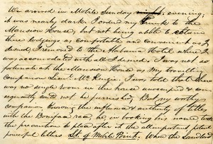
 Detail from Mirabeau B. Lamar’s journal. But leave it to me to carry the handwriting-as-art concept into an even broader realm: the shared experience of people who have written (and, in declining numbers, still write) routinely by hand. Those who have unique or fancy signatures, or who add special little extra loops or curls or flourishes to their regular script (or printing), or who take secret pride in the shapes of their Ps and Qs.
I have a strong appreciation for this kind of handwriting artist’s work. I know it when I see it. I’ve seen it amid the source materials for the pen fonts I’ve made of the scripts of historical Texans—the sweep of the D of Mirabeau Lamar (Lamar Pen), the little vertical cross Emily Austin Perry added to her H (Emily Austin), Sam Houston’s inimitable signature (Houston Pen). Another such font I’ve got cookin’ in the oven adds an interesting twist: the script in Stephen F. Austin’s prison diary, originally written in pencil, was later traced in ink by his nephew, Moses Austin Bryan (Emily’s son).
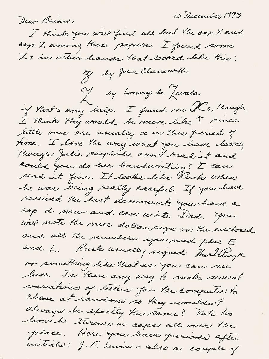
 Detail from Stephen F. Austin’s prison diary. You’ve seen it, too, in the handwriting of certain friends or relatives. Perhaps they heard early on how neat their cursive was, so they took pains to make it more evocative. Perhaps they’re visual artists by nature, and it also carries over onto their notepads. Even sloppy scribblers have quirks curious and endearing. Witness the little crosses on the Zs of Viktorie.
Without question hand-done lettering communicates far more than mere words and sentences—e.g., the mind, age, mood, or proclivities of the writer. Perhaps, in this sort of innate expressiveness, all handwriting might stand as a form of art.
Note: If you know of an example of some particularly artistic penmanship, I’d love it if you’d comment with a link.
*A Mythical Image: The Ideal of India in German Romanticism (Duke University Press, 1964).
Miscellanea
» Award-winning penmanship doesn’t necessarily have anything to do with hands.
» And while were on the subject, here’s another young handwriting champion. Can there be hope for penmanship?
» Perhaps not, as some are editorializing against cursive requirement in schools.
» Meanwhile, archaeologists have uncovered 2,000-year-old handwritten documents in the London mud.
Tags: 18th century handwriting, antique penmanship, calligraphy, cursive script, embellished scripts, Emily Austin font, handwriting as art, hieroglyphs, Houston Pen font, illuminated manuscripts, Lamar Pen font, Leslie willson, neat handwriting messy handwriting, old Dutch script, old handwriting, old Malabar script, petroglyphs, Philippus Baldaeus, pictographs, Texas history, Viktorie font
Posted in Cursive, Graphology, History, Old Letters, Paleography, Penmanship, Ruminations, Specimens | No Comments »
Monday, December 21st, 2015

Recently I stumbled upon Snail Mail My Email, the website for artist Ivan Cash’s online community art project whereby hundreds of volunteers transcribe the email messages of strangers into handwritten letters, which then get dropped in the mail. A novel, fun-sounding idea, to be sure—especially once you realize that most of the letters get the sort of eye-catching embellishments you might find on a greeting card. But what struck me first was its slugline: “Handwritten Letters in a Digital World.”
The idea left me, confusingly, both encouraged and aghast.
 My mother helped with Texas Hero. Granted, there’s no little irony in the fact that I’m batting out these very words on the keyboard of a MacBook Pro—let alone the fact that I rarely ever send a handwritten letter these days. But if you’re a sighted person of a certain age, you’re sure to hold fast in your memory a small library of familiar handwriting samples.
Off the top of my head I can think of at least a dozen people whose penmanship I’d recognize in an instant: my parents, my siblings, my daughter, a grandfather and an aunt, two ex-wives, a couple old coworkers, a few good friends. And that’s not even counting more than a dozen others whose handwriting I’ve preserved in digital form—e.g., Abigail, Viktorie, and Marydale.
But what do you get when you open a letter in a stranger’s handwriting? There’s no flash of recognition at first glance at the hand-addressed envelope. No flutter in your gut as a face comes to mind. No proof that someone known and loved has reached out to you.
 Envelope from my father as a young man. It’s an art project, I get it. But the encounter reminded me that no more will I see envelopes freshly addressed by certain familiar pens—that of my dear mother, for instance, not even in her jiggly, Parkinson’s-induced scrawl. I can at least still revisit scores of her letters I’ve got in safe keeping. Although the flash of recognition lacks fresh brightness, it’s the work of her hand.
The power of familiar script is described with particular poignancy by Virginia resident Elsa Ann Heller, who was surprised to recognize her grandmother’s handwriting on a seventy-year-old postcard decorating a local restaurant:
“I know that sounds pretty old-fashioned, but that is how I know her. Her handwriting is written on my heart.”
 Ornament from Geographica, coming soon. Then again I’m not the only one who’s neglected his penmanship lately. Some time after Heather du Plessis-Allan, a presenter with a New Zealand current affairs TV show, broke a story exposing a loophole that let her buy a gun online without a permit, police showed up with a search warrant looking for handwriting samples. In the wake of the search—which suggests whoever ordered the gun might face punishment for breaking the law—she realized she barely handwrites anything anymore.
“Nowadays, everything is done on my laptop, tablet or cellphone. Even the grocery list. I email that to myself on the way to the supermarket.”
 Detail of S. F. Austin’s journal. Me, meantime? Well, I’m currently working on my first modern serif typeface ever—although it’s based on historical materials. In particular, I’m consulting the maps published by eighteenth-century English engraver Thomas Jefferys, known at the time as the “Geographer for King George III.” The neat lettering on Jefferys’s maps inspired me to give real type design a go for once.
But never fear, because after I finish Geographica, I’ll be making another old penmanship font modeled after the hand of Texas pioneer Stephen F. Austin (in his journal from a Mexican prison, circa 1834–35). And after that I’ve got a pretty cool modern handwriting font planned. Stay tuned!
Miscellanea
» It seems letter-writing clubs are a thing, and the Wonder Fair Letter Writing Club looks like a good one.
» A frightening prospect: machines have been passing the Turing Test—of handwriting.
» An art exhibit called “Good Penmanship” bids penmanship adieu.
Tags: Abigail Adams, art of handwriting, cartographic font, cursive writing, familiar handwriting, family, Geographica font, handwritten letters, letter writing clubs, Marydale font, nostalgia, old maps, penmanship, snailmail, Stephen F Austin, Thomas Jefferys, Viktorie font
Posted in Cursive, News, Old Letters, Penmanship, Ruminations, Specimens | No Comments »
Sunday, October 5th, 2014
I remember when people used to take pride in their penmanship. They’d be proud if it was neat and graceful; they’d be proud if it was undecipherable.
And they’d experiment with it, add little personal flourishes. They’d draw a slash through the letter Z, or use tiny circles where dots should be.
Used to be, the way you wrote—whether longhand or shorthand or printing or scribbling—became an extension of yourself, a sort of fashion statement. Plain and sensible, vivacious and chatty, gloomy, colorful, gray.
“Everyone’s handwriting is as different as the way we express ourselves,” writes Marilou Johanek, a columnist with the Toledo Blade, quoting a teacher friend.
Writing in cursive, another told her, makes you “pay attention to what you’re doing and the words you’re choosing.”
Johanek is one of many who—while acknowledging the fact that (barring an apocalyptic failure of the power grid) modern schoolchildren need only learn how to use a keyboard—believes there’s still value in learning how to write by hand. The Ohio Board of Education contends it “develops fine motor skills and improves literacy.”
Never mind that at a glance it lets you get a picture of a person without even knowing how to read. But reading is the point, of course. Being able to interpret what a hand-writer has—or had—to say.
Last month at an Albuquerque, New Mexico, high school, a less-than-legible bomb threat scribbled on the wall of a boys’ bathroom prompted cautionary evacuations on two straight mornings: authorities weren’t sure if one number in the threatened date was a 5 or a 6.
I can’t say whether it was the writer’s or readers’ fault.
But I can say that, if you can’t turn a string of lines and curves and shapes into the equivalent of spoken words and phrases, you’ll miss out on a world of pleasurable insight.
And every now and then an unpleasant surprise.
I’m reminded of a letter by noted Texas pioneer Emily Austin Perry (whose handwriting inspired our Emily Austin font), written to her husband in 1837, in which a mundane accounting of finances included a shocking sign of the unenlightened times.
Here is that excerpt, literally transcribed:
I have by me at this time a bout Seven Hundred Dollars; Austins & Guys expences will have to come out of it—their is still five Hundred Dollars to draw on the Letter of Credit; in Louisville; If you can sell any of my land, do so; for I wish very much to Buy me a Negro Girl, when I return I shall remain hear un till the first of September; but you will know of my movements, for I shall write every Week—and you must do the same, and in the meantime; if their is no likelihood of the Countrys being invaded again, make every exertion to have the two Rooms Put up by the time I return, for I expect to bring quite a Family back.
(I might note that Rutherford B. Hayes—who visited the Perrys’ Peach Point Plantation in 1848—described Emily as “an excellent motherly sort of woman, whose happiness consists in making others happy.”)
Recently I saw a humorous graphic showing the evolution of the written word, from cuneiform script to Egyptian hieroglyphics to Latin text to colorful, wacky emoticons.
Funny? Yep. But as with all humor, there’s a kernel of bittersweet truth in there somewhere.
Tags: Albert Einstein's handwriting, Emily Austin font, Franz Kafka's handwriting, handwriting, old letters, penmanship, teaching cursive, Viktorie font
Posted in Cursive, Education, Historical Figures, Old Letters, Penmanship, Ruminations | No Comments »
|
|
|
 |
|
 |
|
 |
 |