 |
|
 |
|
|
|
|
 |
 |
 |
 |
 |
 |
 |
|
|
|
|
 |
 |
 |
 |
 |
 |
 |
|
 |
 |
 |
 |
 |
 |
 |
|
|
|
 |
 |
 |
 |
|
|
|
|
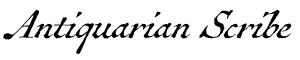
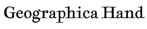
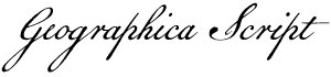
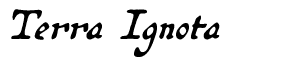
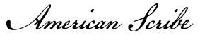
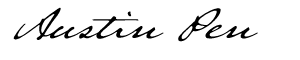
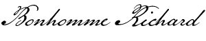
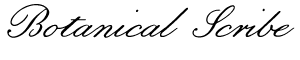
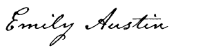
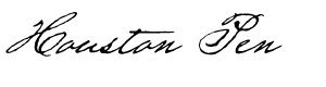
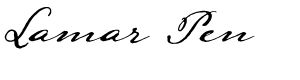
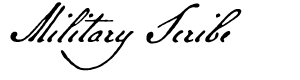
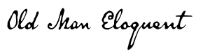
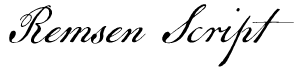
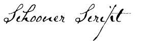
The text face used here (as well as elsewhere) is Broadsheet™. The home page letters are set in Emily Austin™ & Lamar Pen™. All typefaces referenced on this website— Abigail Adams™, American Scribe™, Antiquarian™, Antiquarian Scribe™, Attic Antique™, Austin Pen™, Bonhomme Richard™, Bonsai™, Botanical Scribe™, Broadsheet™, Castine™, Douglass Pen™, Emily Austin™, Geographica™, Geographica Hand™, Geographica Script™, Houston Pen™, Lamar Pen™, Military Scribe™, Old Man Eloquent™, Remsen Script™, Schooner Script™, Terra Ignota™ & Texas Hero™ (as well as all other fonts in the Handwritten History™ Bundle)—are the intellectual property of Three Islands Press (copyright ©1994–2015). For site licensing contact: Three Islands Press P.O. Box 1092 Rockport ME 04856 USA (207) 596-6768 info@oldfonts.com |
|
|
|
|
 |
|
|
|
|
 |
|
|
Posts Tagged ‘antique penmanship’
Sunday, June 5th, 2016
 Old Dutch and Malabar scripts. I have in my possession a book published in Amsterdam in 1672. Its author is Philippus Baldaeus, a Dutch Calvinist missionary, and my copy is written predominantly in German. It’s a big book, whose title (translated into English) is A True detailed description of the famous East Indian Coasts of Malabar and Coromandel, and the island of Ceylon.
Baldaeus accompanied Dutch invaders to southern India and Sri Lanka and came back with a tale to tell. This volume—which my father (Germanic languages professor and literary translator A. Leslie Willson) used in researching a book of his own*—has a number of magnificent plates and a series of pages showing samples of the glyphs and letterforms then used in the ancient written language of the residents of Malabar.
 Egyptian hieroglyphs (the British Museum). The scripts are truly beautiful—both the exotic Brahmic glyphs of Malabar and the looping Dutch script that accompanies it. And they serve as just one example of handwriting as art.
The earliest writers of course used pictographs, then hieroglyphs (pictures representing sounds), which could certainly be considered art. As might the illuminated manuscripts created by Medieval scribes—but that’s not what I mean. I mean handwritten symbols, Latin and otherwise, whose shapes or execution or both represent art in a fundamental way.
 Zapfino specimen. By its very definition, calligraphy is a fine example. The pleasing, expressive sweeps of a calligrapher’s brush or pen can be admired for long moments, can conjure up moods or memories or magic. Calligraphy spans multiple language systems and cultures. In fact, some of the most popular fonts these days are essentially digitized calligraphy—from Zapfino, by late master type designer Hermann Zapf, to the work of contemporary lettering artist Laura Worthington.
Sign painters, poster designers, and graffiti artists also qualify—their hand-rendered letters and words are an unquestionably sincere form of accessible artistic expression. (I’ve received some wonderfully illustrated envelopes from such folks, which I have displayed prominently here and there.)
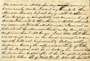 Detail from Mirabeau B. Lamar’s journal. But leave it to me to carry the handwriting-as-art concept into an even broader realm: the shared experience of people who have written (and, in declining numbers, still write) routinely by hand. Those who have unique or fancy signatures, or who add special little extra loops or curls or flourishes to their regular script (or printing), or who take secret pride in the shapes of their Ps and Qs.
I have a strong appreciation for this kind of handwriting artist’s work. I know it when I see it. I’ve seen it amid the source materials for the pen fonts I’ve made of the scripts of historical Texans—the sweep of the D of Mirabeau Lamar (Lamar Pen), the little vertical cross Emily Austin Perry added to her H (Emily Austin), Sam Houston’s inimitable signature (Houston Pen). Another such font I’ve got cookin’ in the oven adds an interesting twist: the script in Stephen F. Austin’s prison diary, originally written in pencil, was later traced in ink by his nephew, Moses Austin Bryan (Emily’s son).
 Detail from Stephen F. Austin’s prison diary. You’ve seen it, too, in the handwriting of certain friends or relatives. Perhaps they heard early on how neat their cursive was, so they took pains to make it more evocative. Perhaps they’re visual artists by nature, and it also carries over onto their notepads. Even sloppy scribblers have quirks curious and endearing. Witness the little crosses on the Zs of Viktorie.
Without question hand-done lettering communicates far more than mere words and sentences—e.g., the mind, age, mood, or proclivities of the writer. Perhaps, in this sort of innate expressiveness, all handwriting might stand as a form of art.
Note: If you know of an example of some particularly artistic penmanship, I’d love it if you’d comment with a link.
*A Mythical Image: The Ideal of India in German Romanticism (Duke University Press, 1964).
Miscellanea
» Award-winning penmanship doesn’t necessarily have anything to do with hands.
» And while were on the subject, here’s another young handwriting champion. Can there be hope for penmanship?
» Perhaps not, as some are editorializing against cursive requirement in schools.
» Meanwhile, archaeologists have uncovered 2,000-year-old handwritten documents in the London mud.
Tags: 18th century handwriting, antique penmanship, calligraphy, cursive script, embellished scripts, Emily Austin font, handwriting as art, hieroglyphs, Houston Pen font, illuminated manuscripts, Lamar Pen font, Leslie willson, neat handwriting messy handwriting, old Dutch script, old handwriting, old Malabar script, petroglyphs, Philippus Baldaeus, pictographs, Texas history, Viktorie font
Posted in Cursive, Graphology, History, Old Letters, Paleography, Penmanship, Ruminations, Specimens | No Comments »
Monday, May 2nd, 2016
I am remiss for not having posted an entry here in so long. The fact of my finally finishing up the first true serif text-type family I’ve ever made is no good excuse (unlike, perhaps, my propensity to enter The Type Design Zone and not emerge for weeks at a time). Anyway, apologies.
But I have something to share today that I hope will make up for the delay: a dive deep into the quirks and peculiarities of 19th-century penmanship—or at least one man’s peculiar, quirky penmanship—that should give you an idea of how to go about deciphering old handwriting. Or at least how I do it.
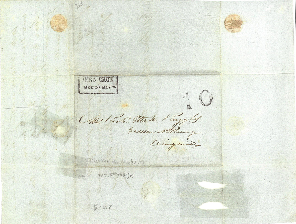 Address page of the Ruggles letter. The penmanship in question appears in a digital scan of a three-page letter (see below) sent to me by an acquaintance who has an enviable collection of historical records and documents from the days of the Republic of Texas. I’d transcribed a handwritten narrative for him already, one whose puzzles were mostly problematic words and short phrases. But this new letter—despite its bold and graceful pen strokes—caught me off guard for its first-blush illegibility. I’ve had plenty of trouble deciphering old handwriting, but at first glance I can usually get a fairly good idea of who had written a thing, or what was being written about. The scan of this letter, with its alluring greenish tinge, seemed more or less inscrutable.
Eventually, though, I managed to puzzle out every word. Here’s how.
An important clue was the destination address on the outside of the folded letter. I’d already looked at the first page, at the date and salutation, but all I could quickly read in the author’s sweeping script was a date that looked like “May 21st, 1838,” the country of origin, “Mexico,” and a town that might’ve been Guadalupe. The outside address was stamped VERA CRUZ MEXICO and had an old notation in pencil that offered two quick corrections: 1) the date was in fact 1848, and the town was Tacubaya (a far cry from Guadalupe!). Upon close inspection, the address appeared to be:
Mrs. Richd Ella M. Ruggles
Fredericksburg, Virginia
Another puzzle. Was this a woman named Ella who was married to a man named Richard Ruggles? At least by now I had determined that the writer’s lowercase “a” looked like an “o” followed by an extra “i”-like stroke. And that the “d” had a very short ascender. After staring for a while I noticed a seemingly random horizontal stroke that told me her name likely wasn’t Ella after all—but Etta.
 Daniel Ruggles. I took a peek at the last page of the letter, which the author had stylishly signed with the just his initials, “D.R.” So if this was a husband in Mexico writing a wife back in Virginia, his given name was clearly not Richard.
I pored for a while over the salutation, which—now that I could identify a few odd-shaped letters—I managed finally to work out: “My dearest Etta.” (I was now confident that was her name, from the way the cross of the “t” in “dearest” nearly missed the letter altogether, as did the cross of the double-“t” in Etta.) I soon also had the first paragraph deciphered. Not that it held a lot of clues. Further on I could read a few words and phrases, among them “prospect of peace,” “treaty,” “the 19th inst. Friday,” and what appeared to be the phrase “Chamber of Deputies.” I saw that the author made peculiar “r”s that had a sort of extra squiggle at the end, figured out that those tiny, two-line shapes were ampersands, grew accustomed to his open, unusual “I”s—and realized he was likely in Mexico because of war.
It was time to poke around online.
By searching for “Mexico,” “war,” and “1848,” I confirmed that the Mexican-American War ended in that year. A treaty was signed in February, but U.S. troops didn’t entirely evacuate until August. So I searched for “Ruggles” and “Mexican-American War”—and first on the list of results was a Wikipedia entry for Daniel Ruggles (1810–1897), a Brigadier General for the Confederacy in the American Civil War. I learned that, before that war, U.S. Lt. Col. Ruggles had served in the Texas Campaign, and later, after a long life, had died in Fredericksburg, Virginia.
A search for “Daniel Ruggles” and “Richard Etta” got me genealogical records showing that Richard Etta (or “Richardetta”) was in fact the wife of Daniel Ruggles. I learned that Etta’s maiden name was Hooe, that her middle initial stood for Mason, that she and Daniel were married in Michigan in 1841, and that she died in 1904. I even got a look at the the Ruggleses’ headstone in Virginia.
Armed with this additional background info (which helped also with the seemingly incongruous mention of “Saut on Ste Marie”) and a sense of context, I set to work transcribing Daniel Ruggles’s letter home to his wife, Richardetta. It took nearly two hours, but I got it done.
Deciphering old penmanship can be a puzzle, for sure, but a puzzle that—thanks, ironically, to the digital technology that might ultimately doom handwriting altogether—often promises a circuitous journey through interesting times gone by.
Below are the scans of the three pages of Ruggles’s letter, each followed by my transcription of that page. (Click any page image for a larger view.) I hope and expect you’ll find its contents surprising and fascinating.
 The Ruggles Letter, page 1. Tacubaya, Mexico
May 21st 1848
My Dearest Etta,
I have an opportunity to send you a line tomorrow morning early and write you, although I sent day before yesterday one with most things of importance noted.
Today however I can confirm in some measure this report in relation to the prospects of peace & it is therefore I write so soon again— as I am well aware that you are looking for every peaceful sound or show of hope as well as myself.
We have a well authenticated rumour that the Chamber of Deputies confirmed the Treaty 54 in favor to 32 against on the 19th inst. Friday last & sent it to the Senate at 8 o.c. p.m. on that day—this comes from Genl. Butler & is believable.
There is no doubt about the favorable actions of the Senate—and if our information is correct peace is certain.
 The Ruggles Letter, page 2. Every preparation has been made for the marching of our Troops towards the coast.
I shall write you now almost daily as I have means of sending letters.
There is some excitement here about a tragic affair of robbery and murder for which Lieut. B. P. Tilden of the 2d Infantry and two volunteer officers from Pennsylvania. Lieuts. Hare & Dutton, have been sentenced to be hanged on the 25th inst. This is the same Lieut. Tilden we saw at the Saut on Ste Marie.
It is said that another officer of the 2d Infy is suspected as an accomplice. The details will soon be published & ring throughout the Union like a bolt of thunder.
Here in the midst of great events these trials have not excited so much interest as was anticipated.
The particulars are voluminous & I must therefore refer you to News as they will appear in the papers. All feel sad for Tildens poor wife, & friends.
 The Ruggles Letter, page 3. Well I have nothing more to write nor have I time if I had.
Love to all the Family—kiſs Ed & Tip for me & Roy & Beſsie & all the children do write me very often.
Particular remembrances to all our friends & kind remembrances to the Servants.
Remember me in your prayers—dream of me & kiſs me in your heart.
Ever thine
D.R.
To/ Mrs. Richard Etta M. Ruggles
Fredericksburg
Virginia
[Note on the last page Riggins’s use of the old-style long-s (“ſ”) in the words “kiss” and “Bessie.”]
Miscellanea
» Turns out 400-year-old handwriting is even trickier to read—and can result in surprises.
» Speaking of transcriptions, Norfolk County, Mass., has digitized 250,000 old deeds—including a few historic ones.
» For its 500th anniversary, The Royal Mail is urging UK residents to dig out old handwritten correspondence.
» Going back way farther: handwriting from 600 B.C. suggests widespread literacy—and an older Old Testament.
» And although it might be delaying the inevitable—the teaching of cursive penmanship ain’t dead just yet.
Tags: 1800s, 1848, 19th century, antique handwriting, antique penmanship, cursive script, Daniel Ruggles, deciphering old handwriting, historical letters, letters home, Mexican-American War, old handwriting, old letters, Texas history, transcribing old handwriting, vintage handwriting
Posted in Cursive, Historical Figures, History, Old Letters, Paleography, Penmanship, Uncategorized | No Comments »
Sunday, September 14th, 2014
Sharing your handwriting with others is a way of sharing part of yourself.
When I read that sentence—written by Gina Logue, a columnist with The Murfreesboro Post, in a piece today on Tennessee’s return to teaching cursive handwriting to grade-schoolers—I found myself smiling in agreement. No keyboarded words will ever compare to those applied with pen to paper.
My mother died eight years ago, but whenever I come across her handwritten words on a note or an envelope or the back of an old photo, her face springs at once to mind. How instantly we recognize the penmanship of a loved one, its size and slant, those familiar quirks and curls.
And without even thinking we catch more subtle signs that add depth and context to the message. The pressure of the pen. A hurried look. Unusual neatness. A pause to reflect.
 A page from Douglass’s lecture on John Brown and Harper’s Ferry. (Click any image for larger view.) Handwritten words, transcending time, move directly from mind to pen to mind.
This idea got me thinking of the many penned words left us by Frederick Douglass, the nineteenth-century American abolitionist and orator. I modeled a font after Douglass’s compact, legible script—Douglass Pen, it’s called—and in the process, more than a century on, he managed to change my mind.
Specifically, Douglass changed my mind about John Brown.
From what I’d learned in school in the 1960s, Brown’s 1859 raid on Harper’s Ferry was the equivalent of domestic terrorism. That his abolitionists crept in by night and killed innocent people in a crazy scheme that was sure to fail. That Brown himself was a wild-eyed crazy man.
But when I read, in his handwritten words, what Douglass had argued so eloquently—that Brown, whom he knew, was an idealistic hero who gave his life for the cause of freedom—I began to research further.
 Letter to Hugh Auld (The Gilder Lehrman Collection on deposit at the Pierpont Morgan Library.) Turns out Henry David Thoreau, too, knew and supported Brown. And most modern historians are gentler on his reputation than those of the twentieth century. Most credit his Harper’s Ferry raid with hastening civil war and the death of slavery—his mission all along.
Still, it was Douglass’s neat, true penmanship in a draft of a Harper’s Ferry lecture that proved, to me, most convincing.
Though fourteen years have passed between us and the tragedy that closed his life, we may yet stand too near to his life and times—to properly weigh and measure the man, or to set a just value upon what he did and attempted in the world. Like the great and good of all the ages the men born in advance of their times—and whose blood stained footprints attest the immense cost of reform, and show us the slow pace of human progress, our grandest American hero and martyr, may have to await the pollishing [sic] wheels of after coming centuries, to give to his great qualities and deeds full effect and glory!
I’ve also got a copy of a letter Frederick Douglass addressed to one of his owners when he was a slave, written two decades after he’d run away. A polite, respectful, forgiving letter, written in 1857. He used one page of lined paper. You could see the care he’d taken in the composition. “I love you,” he wrote, “but hate slavery.”
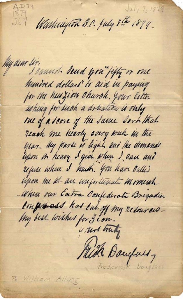 Douglass letter to Zion Church. And another note, a reply to a letter asking for money to help build a church, includes pithy sentences that communicate a lot. “My purse is light,” he wrote, “and the demands upon it heavy. I give when I can and refuse when I must.” The man had a classic orator’s way with words.
In working so many long hours recreating Douglass’s penmanship, I’ve come to be able to recognize his hand. As I do my parents’—or past loves who broke my heart.
A lot more gets said through handwriting than merely words.
* * *
Recent links…
» LOGUE: Tennessee putting cursive back in handwriting in 2015—The Murfreesboro Post
» Pens for Better Penmanship: Don’t Forget (How) to Write!—The Wall Street Journal
» In The Age of Keyboards, Don’t Neglect Your Penmanship—Big Think
» Handwriting reveals kids’ inner anxiety—The Times of India
Tags: antique penmanship, art of handwriting, Douglass Pen font, Frederick Douglass, Henry David Thoreau, old handwriting
Posted in Cursive, Education, Historical Figures, Old Letters, Penmanship, Ruminations, Specimens | No Comments »
|
|
|
|
|
|
|
|
|


