|
|
 |
|
|
|
|
 |
 |
 |
 |
 |
 |
 |
|
|
|
|
 |
 |
 |
 |
 |
 |
 |
|
 |
 |
 |
 |
 |
 |
 |
|
|
|
 |
 |
 |
 |
|
|
|
|
The text face used here (as well as elsewhere) is Broadsheet™. The home page letters are set in Emily Austin™ & Lamar Pen™. All typefaces referenced on this website— Abigail Adams™, American Scribe™, Antiquarian™, Antiquarian Scribe™, Attic Antique™, Austin Pen™, Bonhomme Richard™, Bonsai™, Botanical Scribe™, Broadsheet™, Castine™, Douglass Pen™, Emily Austin™, Geographica™, Geographica Hand™, Geographica Script™, Houston Pen™, Lamar Pen™, Military Scribe™, Old Man Eloquent™, Remsen Script™, Schooner Script™, Terra Ignota™ & Texas Hero™ (as well as all other fonts in the Handwritten History™ Bundle)—are the intellectual property of Three Islands Press (copyright ©1994–2015). For site licensing contact: Three Islands Press P.O. Box 1092 Rockport ME 04856 USA (207) 596-6768 info@oldfonts.com |
|
|
|
|
 |
|
|
|
|
 |
|
|
Posts Tagged ‘handwriting’
Sunday, June 21st, 2015
 Envelope from Camp Maxey. My father spent a lot of time writing, starting at a delicate age. Early on he aspired to be an author, kept a diary for many years, wrote poems and stories and at least one novel. And he had handsome penmanship, too: a standard, legible cursive with only a few peculiarities—including a “p” with a tallish upstroke and a formal “r.”
But my dad could also type like a maestro. I remember as a boy hearing the sound of his old manual typewriter clattering away in his study. I remember asking him to show me how he made that magical thing work. And I remember later thinking it impossible to type so fast (120 words a minute, as I recall). Then in high school I took a typing class, and before too long I could type nearly as fast as Dad.
 Dad’s first letter home. Still, at least early on, my father tended to write all his personal letters by hand. Like the daily letters home he wrote from basic training in 1943.
After he died I discovered that at some point Dad had typed up all those 1943 letters—keyboarded them into his Mac, saved them to floppy disks, printed out all the pages, collected them into loose-leaf binder. The letters span a period from May 9th to July 31st and take up 212 typewritten pages. A cover page is titled “Letters Home.”
Some time later I found a box containing the original handwritten letters he’d sent home to Amarillo. Each page of U. S. Army stationery is completely covered with my father’s airy, twenty-year-old hand. Written mostly in pencil, his letters tell of every mundane event, list the books and magazines he’s reading, relate the things he’s thinking about. Some of his youthful observations are stirring, almost poetic. He writes, for instance, during a time of waiting:
When a day is with me, it stays so long. But when it is away from me, it seems to have lasted so short a time.
 The circus comes to town. I also have here a journal for the year 1947, a year of uncertainty for my father—a summer home after college, a time of girl troubles—that includes a remarkable page devoted entirely to a visit to the circus. You can almost feel from the angle of the penmanship his delight with the event before even reading the words:
The show itself was furiously thrilling. From the opening act of wild animal trainers to the closing parade of wrinkled, dust-covered elephants, one could not catch the many thrills with the eyes and ears.
(Dad was a man of wonder.)
But perhaps the most touching thing I found earlier today while going through a box old family keepsakes: his handwritten description—in white ink on the black page of a photo album—of a picture he’d taken of his beloved dog Bill:
Snow and a beautiful day enabled me to get this splendid shot of Bill. I got Bill in 1930 when he could hardly walk. I snapped this the winter before he was 10. This is the once-in-a-lifetime picture that turned out exactly like you wanted it to. Bill could sit up, clap his paws, play hide and seek and do other things once, but now he can still sit up. He is a swell dog.
.") Photo of my dad’s dog, Bill. (At one point the angle of his writing changes, as does its vividness, where he’s paused to replenish his ink.)
Dad’s handwriting was so legible that in 1997 I modeled a font after it. I called it Professor, after his eventual distinguished career—a career that, sure enough, involved a lot of writing (and literary translation). Right away he installed the font on his Mac and took to using it to personalize his correspondences while still typing at breakneck speed. The relative popularity of Professor tickled him no end.
Until the end.
Happy Father’s Day, Dad.
* * *
Work continues on Military Scribe font, meantime, due for release on the Fourth of July. Since it simulates the troop rosters of the His Majesty’s Tenth Regiment of Foot (circa late 1770s), I thought I’d give you a sneak peek at its current state by list some actual regimental names.
 A draft specimen of Military Scribe (coming July 4th).
Tags: A Leslie Willson, basic training, cursive, Fathers Day, handwriting, handwritten letters, historical letters, legible, letters home, penmanship, Professor font, World War II, WWII
Posted in Cursive, Old Letters, Penmanship | No Comments »
Thursday, June 4th, 2015
 Wild bird species list. It recurs to me—as I take up my keyboard, sheepishly, to compose my first missive here in far too long—that I hardly write anything by hand anymore. For all my “Woe are we who no longer put pen to paper” laments, I don’t exactly practice what I preach. My handwriting lately appears mostly just on things I sign (few, in this increasingly paperless world) or the blank three-by-five-inch index cards I fill obsessively with lists and doodles (mostly doodles). And it ain’t exactly what you’d describe as “cursive.”
These days, in fact, I write so little that hand-cramp comes after I’ve penned not much more than a paragraph.
But if the honeybee population crashes, and big agriculture fails, and civilization is thrown into turmoil, and the electrical grid goes down, I’d still know how to write, at least— although I would have to brush up on my horsemanship.
 Mom provided the source materials for my first old script font, Texas Hero. A few of us do still communicate via old-style letters instead of email. Neuroscientists even believe it worthwhile to resist the modern convenience of the keyboard. Yes, digital technology has in the past generation or so swallowed up and superseded our old pen-and-paper ways—whither film photography? magnetic audiotape?—but it turns out that commanding my fingers to manipulate a tool into coaxing tiny curves and loops and circles and stars onto a three-by-five-inch index card is better exercise for my brain than simply commanding my fingertips tap out a series of keys.
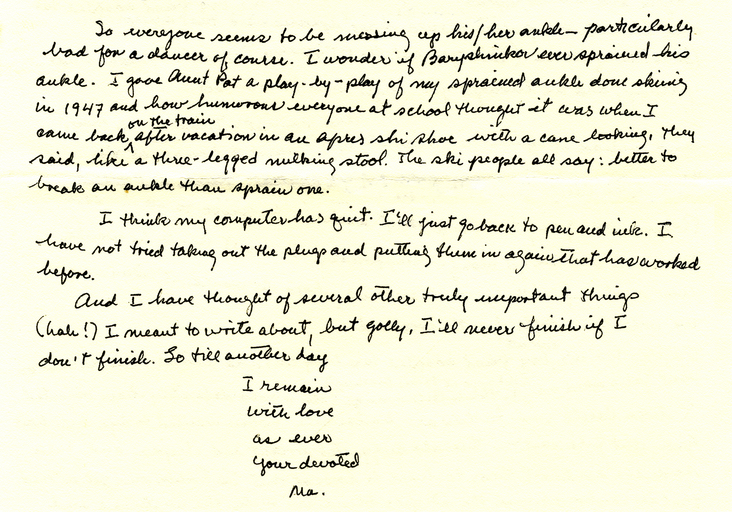
Back in the early days of personal computers, my fast-typing father (a technophile) was quick to embrace—and introduce me to—the Apple Macintosh. My mother (a technophobe) never had any use for such things. But Mom could sure write a mean letter. What I have now from my dad is a large digital archive of epistolary files; what I have from my mom are scores of her handwritten letters.
I could always tell from Mom’s familiarly small, looping cursive when she was pensive and when she was in a hurry. I can easily see when her letter was interrupted by one of the many pressing chores that filled her busy days. And I can certainly see, in her later correspondence, the jittery, up-and-down effects Parkinson’s Disease had on her penmanship. Still, her words were always measured and expressive, her hand ever allusive and refined.
And still her letters have a sound. A smell. A feel.
 After Parkinson’s had set in. (Ma always closed this way.) * * *
 Coming 07/04/2015. I’m currently at work on a vintage handwriting face that seeks to replicate the dense, compact, disconnected cursive script on troop rosters of His Majesty’s Tenth Regiment of Foot, circa 1776–1778. The Tenth of Foot is famous for having fought against American colonial revolutionaries at the Battles of Lexington and Concord and the Battle of Bunker Hill.
I’m pretty excited about this one. It should be legible, distinctive, and authentic for the period. I expect to release it by July 4th, 2015. (If you’d like me to let you know when it’s finished, feel free to sign up for our email newsletter.)
* * *
Honestly, though, I just can’t live without a stack of blank three-by-five-inch index cards.
 A doodle.
Tags: correspondence, doodles, epistolary, handwriting, handwritten letters, Military Scribe font, old letters, penmanship
Posted in Cursive, Old Letters, Penmanship | 2 Comments »
Sunday, October 5th, 2014
I remember when people used to take pride in their penmanship. They’d be proud if it was neat and graceful; they’d be proud if it was undecipherable.
And they’d experiment with it, add little personal flourishes. They’d draw a slash through the letter Z, or use tiny circles where dots should be.
Used to be, the way you wrote—whether longhand or shorthand or printing or scribbling—became an extension of yourself, a sort of fashion statement. Plain and sensible, vivacious and chatty, gloomy, colorful, gray.
“Everyone’s handwriting is as different as the way we express ourselves,” writes Marilou Johanek, a columnist with the Toledo Blade, quoting a teacher friend.
Writing in cursive, another told her, makes you “pay attention to what you’re doing and the words you’re choosing.”
Johanek is one of many who—while acknowledging the fact that (barring an apocalyptic failure of the power grid) modern schoolchildren need only learn how to use a keyboard—believes there’s still value in learning how to write by hand. The Ohio Board of Education contends it “develops fine motor skills and improves literacy.”
Never mind that at a glance it lets you get a picture of a person without even knowing how to read. But reading is the point, of course. Being able to interpret what a hand-writer has—or had—to say.
Last month at an Albuquerque, New Mexico, high school, a less-than-legible bomb threat scribbled on the wall of a boys’ bathroom prompted cautionary evacuations on two straight mornings: authorities weren’t sure if one number in the threatened date was a 5 or a 6.
I can’t say whether it was the writer’s or readers’ fault.
But I can say that, if you can’t turn a string of lines and curves and shapes into the equivalent of spoken words and phrases, you’ll miss out on a world of pleasurable insight.
And every now and then an unpleasant surprise.
I’m reminded of a letter by noted Texas pioneer Emily Austin Perry (whose handwriting inspired our Emily Austin font), written to her husband in 1837, in which a mundane accounting of finances included a shocking sign of the unenlightened times.
Here is that excerpt, literally transcribed:
I have by me at this time a bout Seven Hundred Dollars; Austins & Guys expences will have to come out of it—their is still five Hundred Dollars to draw on the Letter of Credit; in Louisville; If you can sell any of my land, do so; for I wish very much to Buy me a Negro Girl, when I return I shall remain hear un till the first of September; but you will know of my movements, for I shall write every Week—and you must do the same, and in the meantime; if their is no likelihood of the Countrys being invaded again, make every exertion to have the two Rooms Put up by the time I return, for I expect to bring quite a Family back.
(I might note that Rutherford B. Hayes—who visited the Perrys’ Peach Point Plantation in 1848—described Emily as “an excellent motherly sort of woman, whose happiness consists in making others happy.”)
Recently I saw a humorous graphic showing the evolution of the written word, from cuneiform script to Egyptian hieroglyphics to Latin text to colorful, wacky emoticons.
Funny? Yep. But as with all humor, there’s a kernel of bittersweet truth in there somewhere.
Tags: Albert Einstein's handwriting, Emily Austin font, Franz Kafka's handwriting, handwriting, old letters, penmanship, teaching cursive, Viktorie font
Posted in Cursive, Education, Historical Figures, Old Letters, Penmanship, Ruminations | No Comments »
|
|
|
|
|
|
|
|
|


.")