 |
 |
 |
 |
|
|
 |
 |
 |
 |
 |
 |
 |
 |
 |
|
|
 |
 |
 |
 |
 |
 |
 |
 |
 |
 |
 |
 |
 |
 |
 |
 |
|
|
 |
 |
 |
 |
 |
 |
|
|
 |
The text face used here (as well as elsewhere) is Broadsheet™. The home page letters are set in Emily Austin™ & Lamar Pen™. All typefaces referenced on this website— Abigail Adams™, American Scribe™, Antiquarian™, Antiquarian Scribe™, Attic Antique™, Austin Pen™, Bonhomme Richard™, Bonsai™, Botanical Scribe™, Broadsheet™, Castine™, Douglass Pen™, Emily Austin™, Geographica™, Geographica Hand™, Geographica Script™, Houston Pen™, Lamar Pen™, Military Scribe™, Old Man Eloquent™, Remsen Script™, Schooner Script™, Terra Ignota™ & Texas Hero™ (as well as all other fonts in the Handwritten History™ Bundle)—are the intellectual property of Three Islands Press (copyright ©1994–2015). For site licensing contact: Three Islands Press P.O. Box 1092 Rockport ME 04856 USA (207) 596-6768 info@oldfonts.com |
|
|
|
 |
 |
 |
|
|
 |
 |
 |
|
Posts Tagged ‘teaching cursive’
Sunday, September 17th, 2017
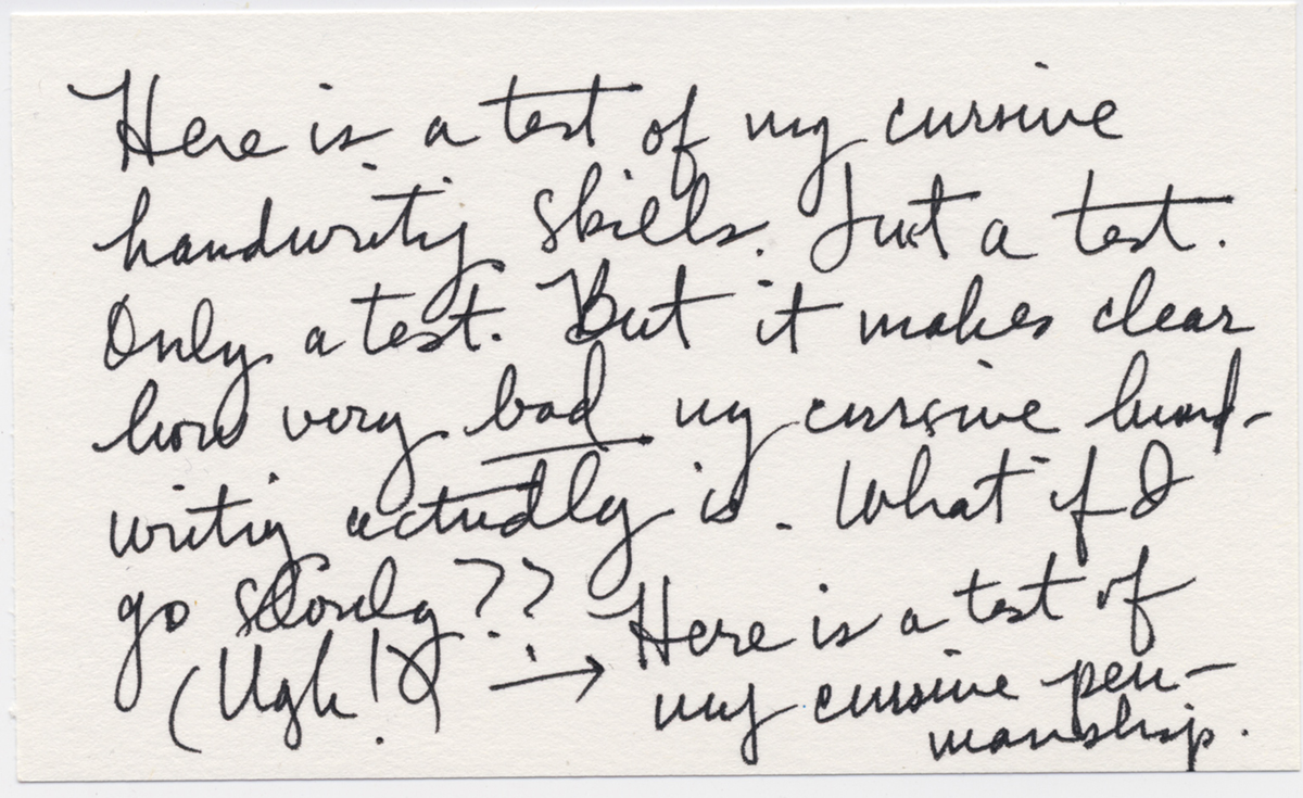
 My cursive handwriting test. A confession: my cursive handwriting sucks. I write by hand so rarely these days, and when I do, it tends to come out as a sort of stylized printing I forced on myself thirty or forty years ago. So I just tried writing a few short cursive sentences on an index card to see what it looks like.
Yeah, it sucks. In fact, I couldn’t even remember how to write a capital “T.”
Alas, I’m not alone. What got me testing out my cursive today was a recent news item about how Cambridge University educators are considering dropping their handwritten exam requirement—after more than 800 years. The problem being that the faculty is having trouble reading students’ handwriting.
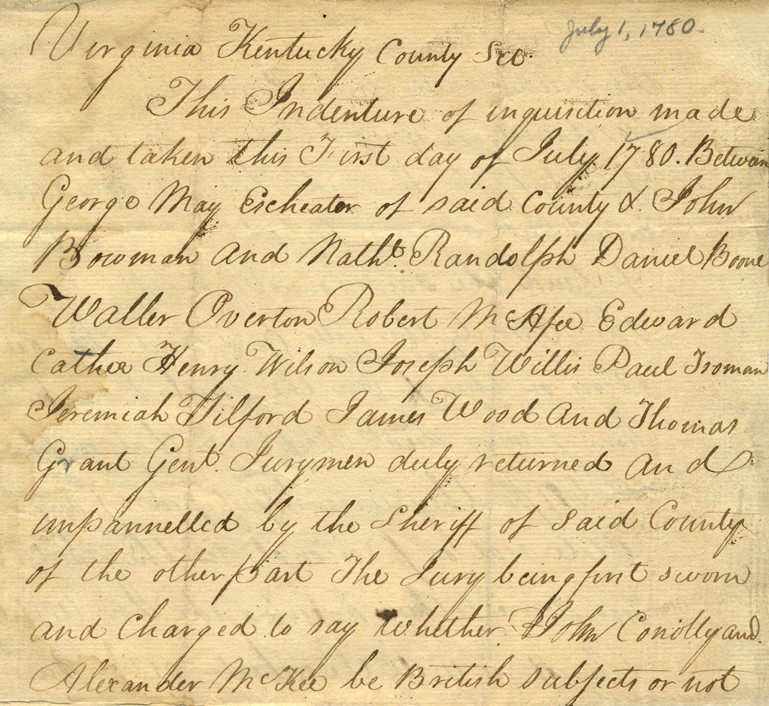
 18th-century penmanship from Kentucky County, Virginia. “There has definitely been a downward trend,” says history lecturer Sarah Pearsall. “It is difficult for both the students and the examiners, as it is harder and harder to read these scripts.”
Bummer.
A Need for Speed
But I’ve long predicted this. Our smart digital devices are feeding our need for speed when it comes to all forms of communication. I mean, let’s face it: it takes a lot longer to write a thank-you note by hand than to tap out a text with your thumbs. Sure, taking the time to learn cursive might be good for your brain, your manual dexterity, and your memory, but first-world humans just prefer living in the fast lane these days, apparently.
 The handwriting of Meriwether Lewis. This got me wondering (not for the first time) how things might change if the grid goes down. Say a computer virus, an asteroid, a natural (or nuclear) disaster, solar flares, or Siri Personified takes us all offline in an instant. How will we communicate over long distances in such a post-apocalyptic scenario? Well, I reckon we’ll have to go back to scribbling out notes using charcoal on birch bark and handing them to a courier, who will deliver them to our remote recipient in person. And I can imagine the dismay on the face of our correspondent who can’t read a word we’ve written.
“Return to Sender. Illegible.”
Learn by Doing
Perhaps at the very least it’s worth practicing—if not your cursive—your hand-printing every now and then. Maybe by jotting down a grocery list, composing a thank-you note by hand, or authoring an actual letter, inserting it into an envelope, and dropping it in the U.S. Mail. I daresay pen makers and the U.S. Postal Service will appreciate it, as will your recipients. So long as they can read your writing.
The irony is that, during the decades of the decline of my penmanship, I’ve taught myself to decipher various styles of cursive handwriting from centuries gone by. And you can bet there’ll be someone with similar skills to help us out centuries from now:
“Siri, read me that old cursive letter.”
Miscellanea
» Cursive makes you smarter: a wonderful essay about all this stuff.
» Another articulate argument for not scrapping handwriting instruction.
» To heck with handwriting recognition: recognizing handwriting is a moving experience.
» Geneva, Ohio, honors the master penman who created Spencerian Script.
» Yes, truly exercising the brain sometimes takes a little time.
» On the 200th anniversary of Jane Austen’s death, a graphologist reveals a few secrets.
» Finally, Darick “DDS” Spears has released a new hip hop album called “Penmanship.”
Tags: bad penmanship, cursive, cursive hanwriting, digital devices, grid goes down, handwriting, handwriting in schools, handwritten letters, illegible, letter-writing, long-distance communication, need for speed, old handwriting, penmanship, poor penmanship, post-apocalyptic, practice, teaching cursive
Posted in 21st Century, Communication, Cursive, Education, Graphology, Historical Figures, History, Literacy, Longhand, News, Old Letters, Penmanship, Ruminations, Specimens | 2 Comments »
Monday, March 6th, 2017
Are cries of “long live longhand!” being heard? Although I don’t dare declare it so—it’s starting to seem that reports of cursive’s demise are premature.
I am remiss, meanwhile, for not having at least dashed off a little update here on The Penman over the past few months. Instead, I had my head down, working to finish our latest font, Geographica Script, a replication of 18th century roundhand. The task of type design is, for me, a matter of sustained fixation—so many tiny tasks to complete over the course of hours, days, weeks, and (in this case) months. When it comes to font work, I just dive in and go.
Perhaps it’s because elsewhere in my life I tend to procrastinate.
But the font is done, and delivered to distributors, and now’s a good time to sit back and ruminate over my odd mission to preserve and make accessible old penmanship styles. It’s a mission I question often. (Is my work in fact having the opposite effect?) But when an early licensee of Geographica Script mentioned his reason for ordering—he’s up in his 70s, has missed the days of longhand, and wants to ensure that his grandchildren can read and appreciate a cursive hand—I remembered one reason I’ve been keeping the discussion alive.
That’s when I ventured a quick scan of recent online mentions of penmanship and handwriting. Lo, there’s been a shift—and the news is encouraging.
For one thing, schools in a few U.S. states have begun requiring handwriting instruction again, instruction not required by the Common Core Standards adopted in 2010. A state rep in Ohio has recently introduced a bill to require students to be proficient in cursive by fifth grade. Arizona has similar legislation on the books already. Louisiana has also begun learn cursive from third through twelfth grade. Education officials in New York City, meantime, are distributing handbooks on handwriting instruction to schools—which have the final say on whether to teach it.
 Google image search for “old letters.” And support for a revival isn’t just coming from older folks lamenting how things used to be. A younger, online crowd is showing an interest in the “ancient” art of hand-lettering. Just google “old letters,” and you’ll get more than 300 million results, and scores of lovely images of vintage script. Ironically, it seems, easy new imaging technology is managing to preserve—perhaps even popularize—that old outdated longhand.
Current typographic trends also show a fascination with loopy cursives. Just check a graphic design site or two, and you’ll see what I mean. Never mind the science that describes cognitive benefits from manipulating pens and pencils—and their tendency to slow you down.
Of course, it’s never wise to underestimate the lament of a grandparent. Nor is it a bad idea to make sure new generations can still read their ancestors’ letters—or even becoming adept at writing that way.
 Examples of Library Hand. Cataloguers’ Hand
One interesting historical handwriting relic I stumbled over the other day is Library Hand, a style of lettering developed in the late 19th century expressly for card catalogs. At a four-day gathering in 1887, librarians and “cataloguers” sought to standardize what at the time were wildly varying writing styles—not all of them legible.
(“The handwriting of the old-fashioned writing master is quite as illegible as that of the most illiterate boor,” this article in Atlas Obscura quotes from a New York Library School handbook.)
Both near-typewritten and “joined-hand” styles emerged from the 1887 meeting, each painstakingly, nitpickingly standardized. Eventually, of course, typewritten cards took hold—and more recently card catalogs have more or less completely vanished. Lucky for us, reproductions of Library Hand were saved.
Miscellanea
» Praise of the good ol’ handwritten letter (a powerful gesture).
» Another feature of handwriting (as I’ve mentioned here): it can help diagnose illness.
» Of course it can also shed light on the personality of, let’s say, the POTUS.
» Robots are even trying their mechanical hand at, well, handwriting (good luck with that).
» With longhand making something of a comeback, how will you do in this cursive quiz?
Tags: Arizona, cursive, cursive in schools, cursive instruction, cursive script, cursive writing, Geographica Script, handwriting, handwriting instruction, handwritten letters, historical, library hand, longhand, longhand resurgence, Louisiana, New York schools, Ohio, old handwriting, old letters, pen, pencil, penmanship, Professor font, teaching cursive
Posted in 1700s, 19th Century, 20th Century, Communication, Cursive, Education, History, Literacy, Longhand, News, Old Letters, Penmanship, Round Hand, Ruminations, Science | No Comments »
Sunday, October 5th, 2014
I remember when people used to take pride in their penmanship. They’d be proud if it was neat and graceful; they’d be proud if it was undecipherable.
And they’d experiment with it, add little personal flourishes. They’d draw a slash through the letter Z, or use tiny circles where dots should be.
Used to be, the way you wrote—whether longhand or shorthand or printing or scribbling—became an extension of yourself, a sort of fashion statement. Plain and sensible, vivacious and chatty, gloomy, colorful, gray.
“Everyone’s handwriting is as different as the way we express ourselves,” writes Marilou Johanek, a columnist with the Toledo Blade, quoting a teacher friend.
Writing in cursive, another told her, makes you “pay attention to what you’re doing and the words you’re choosing.”
Johanek is one of many who—while acknowledging the fact that (barring an apocalyptic failure of the power grid) modern schoolchildren need only learn how to use a keyboard—believes there’s still value in learning how to write by hand. The Ohio Board of Education contends it “develops fine motor skills and improves literacy.”
Never mind that at a glance it lets you get a picture of a person without even knowing how to read. But reading is the point, of course. Being able to interpret what a hand-writer has—or had—to say.
Last month at an Albuquerque, New Mexico, high school, a less-than-legible bomb threat scribbled on the wall of a boys’ bathroom prompted cautionary evacuations on two straight mornings: authorities weren’t sure if one number in the threatened date was a 5 or a 6.
I can’t say whether it was the writer’s or readers’ fault.
But I can say that, if you can’t turn a string of lines and curves and shapes into the equivalent of spoken words and phrases, you’ll miss out on a world of pleasurable insight.
And every now and then an unpleasant surprise.
I’m reminded of a letter by noted Texas pioneer Emily Austin Perry (whose handwriting inspired our Emily Austin font), written to her husband in 1837, in which a mundane accounting of finances included a shocking sign of the unenlightened times.
Here is that excerpt, literally transcribed:
I have by me at this time a bout Seven Hundred Dollars; Austins & Guys expences will have to come out of it—their is still five Hundred Dollars to draw on the Letter of Credit; in Louisville; If you can sell any of my land, do so; for I wish very much to Buy me a Negro Girl, when I return I shall remain hear un till the first of September; but you will know of my movements, for I shall write every Week—and you must do the same, and in the meantime; if their is no likelihood of the Countrys being invaded again, make every exertion to have the two Rooms Put up by the time I return, for I expect to bring quite a Family back.
(I might note that Rutherford B. Hayes—who visited the Perrys’ Peach Point Plantation in 1848—described Emily as “an excellent motherly sort of woman, whose happiness consists in making others happy.”)
Recently I saw a humorous graphic showing the evolution of the written word, from cuneiform script to Egyptian hieroglyphics to Latin text to colorful, wacky emoticons.
Funny? Yep. But as with all humor, there’s a kernel of bittersweet truth in there somewhere.
Tags: Albert Einstein's handwriting, Emily Austin font, Franz Kafka's handwriting, handwriting, old letters, penmanship, teaching cursive, Viktorie font
Posted in Cursive, Education, Historical Figures, Old Letters, Penmanship, Ruminations | No Comments »
|
|
|
 |
|
 |
|
 |
 |