 |
|
 |
|
|
|
|
 |
 |
 |
 |
 |
 |
 |
|
|
|
|
 |
 |
 |
 |
 |
 |
 |
|
 |
 |
 |
 |
 |
 |
 |
|
|
|
 |
 |
 |
 |
|
|
|
|
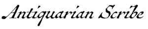
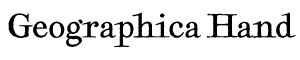
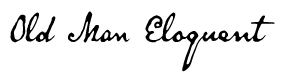
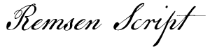
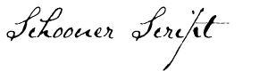
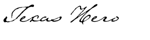
The text face used here (as well as elsewhere) is Broadsheet™. The home page letters are set in Emily Austin™ & Lamar Pen™. All typefaces referenced on this website— Abigail Adams™, American Scribe™, Antiquarian™, Antiquarian Scribe™, Attic Antique™, Austin Pen™, Bonhomme Richard™, Bonsai™, Botanical Scribe™, Broadsheet™, Castine™, Douglass Pen™, Emily Austin™, Geographica™, Geographica Hand™, Geographica Script™, Houston Pen™, Lamar Pen™, Military Scribe™, Old Man Eloquent™, Remsen Script™, Schooner Script™, Terra Ignota™ & Texas Hero™ (as well as all other fonts in the Handwritten History™ Bundle)—are the intellectual property of Three Islands Press (copyright ©1994–2015). For site licensing contact: Three Islands Press P.O. Box 1092 Rockport ME 04856 USA (207) 596-6768 info@oldfonts.com |
|
|
|
|
 |
|
|
|
|
 |
|
|
Archive for the ‘1700s’ Category
Sunday, October 21st, 2018
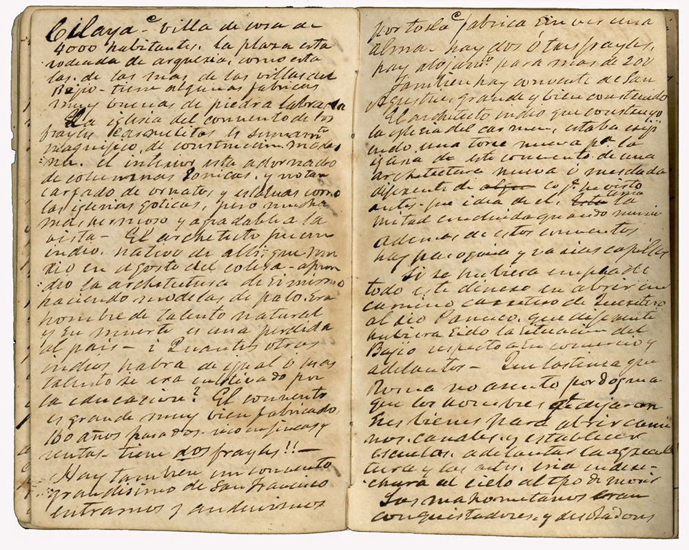 Stephen F. Austin’s prison diary. Last February I released Austin Pen, my 14th typeface simulating real historical handwriting—and my 33rd overall. Soon after, I decided it would be my last original type design. Making a modern font takes hundreds of hours over a span of several months. At least for me it does. Probably I’m slow, or overly painstaking, or merely perfectionistic (considering I’m never entirely satisfied with the end result).
But I’ve reached an age where I feel compelled to spend time creating other things I’d like to make while there’s still time. Which is no doubt why I haven’t polished off a new Antique Penman post since February. I apologize for that.
 Thomas J. Rusk’s lament. Just yesterday I got to looking back at Texas Hero, my very first old pen font, which I started working on pretty much exactly 25 years ago. Texas Hero was, I’m pretty sure, the first typeface designed to replicate the look of genuine old handwriting, warts and all. I was new at the font game back then, having made three eclectic faces earlier in 1993. Didn’t know what I was doing at first, and certainly had no idea what I was getting myself into.
I recall one day hunting around for a font that looked like 18th century handwriting—and finding none. For not the first time, I decided to fill a void. My indispensable partner in this enterprise was my late ma, Jeanne R. Willson, a historical librarian who then worked at what is now the Dolph Briscoe Center for American History at the University of Texas (my alma mater). I knew she had long studied historical letters and documents and would certainly be able to supply examples of old cursive script.
 Emily Austin Perry’s hand. And she did. I got photocopies of letters from several famous Texans (naturally) dating back to the time of the Republic. I got to see the handwriting of folks like Sam Houston, Mirabeau B. Lamar, Stephen F. Austin, Emily Austin Perry, David Burnet (I think), and Thomas J. Rusk. All their hands were distinctly different—fancy, flowery, bold, intricate, and/or a bit messy—but one had just the balance of legibility and period authenticity: Rusk’s.
When people think of Texas heroes, they don’t usually think of Thomas Jefferson Rusk. But he served as a general at the Battle of San Jacinto, as the fledgling Republic’s first Secretary of War, and in 1846 was elected one of the new state’s first U.S. Senators (the other being Houston). He died in 1857, at age 53, by self-inflicted gunshot wound.
 Frederick Douglass’s penmanship. I remember vividly having to look extremely closely at Rusk’s handwriting, getting intimately familiar with his loops and curves, reading and rereading several of his official letters—and one sad, oft-folded lament of the death of his two-year-old namesake son. It was the first of many times I found myself both deeply moved and somehow changed by the words and penmanship of a person who’d died more than a century ago.*
Over the next two and a half decades, I’d go on to replicate the hands of Stephen Austin, his sister Emily, Lamar, and Houston—along with such other famous pen-wielders as Abigail Adams, her son John Quincy, Frederick Douglass, Timothy Matlack (engrosser of the Declaration of Independence) and a few lesser-known writers of old. It all still seems implausible and crazy and sort of wonderful.
And still I think often of the closeness, familiarity, and nuance we stand to lose in this era of keyboards and texting and speech-to-text. We might even end up communicating like we did before the age of literacy: verbally or visually or via smoke signal.
I hold out hope, though, that writing by hand will remain a thing—even if only a sort of calligraphic art form.
*So moved, in fact, that I wrote this novel.
Miscellanea
» Handwriting the Constitution: Hand-copying produces “an intimate connection to the text and its meaning.”
» Royal Archives, Hamilton, and King George III: “Pieces of paper with old handwriting on [it].”
» Big Trouble in Canada: “‘I can’t read writing. We didn’t do it in school.’”
» The Magic of Handwriting: I’m truly sorry I missed this exhibition at The Morgan Library & Museum.
» A Tribute to the Fountain Pen: “No one writes like Abraham Lincoln anymore.”
» Apple Patents Handwriting Recognition System: This just seems so wrong.
» The Tragic Death of the Handwritten Message: Survey shows people age 25–34 prefer emojis to words.
Tags: 19th century, Abigail Adams, American Scribe font, antique penmanship, British soldiers, cursive, cursive script, Douglass Pen font, Emily Austin, Emily Austin font, Frederick Douglass, handwriting, historical letters, Houston Pen, John Quincy Adams, Lamar Pen font, letter-writing, Old Man Eloquent, Sam Houston, Texas Hero font, Thomas Jefferson Rusk, Timothy Matlack
Posted in 1700s, 18th Century, 19th Century, American History, Calligraphy, Communication, Cursive, Historical Figures, History, Old Letters, Penmanship, Ruminations, Specimens, Texas History | No Comments »
Monday, March 6th, 2017
Are cries of “long live longhand!” being heard? Although I don’t dare declare it so—it’s starting to seem that reports of cursive’s demise are premature.
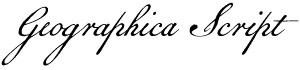
I am remiss, meanwhile, for not having at least dashed off a little update here on The Penman over the past few months. Instead, I had my head down, working to finish our latest font, Geographica Script, a replication of 18th century roundhand. The task of type design is, for me, a matter of sustained fixation—so many tiny tasks to complete over the course of hours, days, weeks, and (in this case) months. When it comes to font work, I just dive in and go.
Perhaps it’s because elsewhere in my life I tend to procrastinate.
But the font is done, and delivered to distributors, and now’s a good time to sit back and ruminate over my odd mission to preserve and make accessible old penmanship styles. It’s a mission I question often. (Is my work in fact having the opposite effect?) But when an early licensee of Geographica Script mentioned his reason for ordering—he’s up in his 70s, has missed the days of longhand, and wants to ensure that his grandchildren can read and appreciate a cursive hand—I remembered one reason I’ve been keeping the discussion alive.
That’s when I ventured a quick scan of recent online mentions of penmanship and handwriting. Lo, there’s been a shift—and the news is encouraging.
For one thing, schools in a few U.S. states have begun requiring handwriting instruction again, instruction not required by the Common Core Standards adopted in 2010. A state rep in Ohio has recently introduced a bill to require students to be proficient in cursive by fifth grade. Arizona has similar legislation on the books already. Louisiana has also begun learn cursive from third through twelfth grade. Education officials in New York City, meantime, are distributing handbooks on handwriting instruction to schools—which have the final say on whether to teach it.
 Google image search for “old letters.” And support for a revival isn’t just coming from older folks lamenting how things used to be. A younger, online crowd is showing an interest in the “ancient” art of hand-lettering. Just google “old letters,” and you’ll get more than 300 million results, and scores of lovely images of vintage script. Ironically, it seems, easy new imaging technology is managing to preserve—perhaps even popularize—that old outdated longhand.
Current typographic trends also show a fascination with loopy cursives. Just check a graphic design site or two, and you’ll see what I mean. Never mind the science that describes cognitive benefits from manipulating pens and pencils—and their tendency to slow you down.
Of course, it’s never wise to underestimate the lament of a grandparent. Nor is it a bad idea to make sure new generations can still read their ancestors’ letters—or even becoming adept at writing that way.
 Examples of Library Hand. Cataloguers’ Hand
One interesting historical handwriting relic I stumbled over the other day is Library Hand, a style of lettering developed in the late 19th century expressly for card catalogs. At a four-day gathering in 1887, librarians and “cataloguers” sought to standardize what at the time were wildly varying writing styles—not all of them legible.
(“The handwriting of the old-fashioned writing master is quite as illegible as that of the most illiterate boor,” this article in Atlas Obscura quotes from a New York Library School handbook.)
Both near-typewritten and “joined-hand” styles emerged from the 1887 meeting, each painstakingly, nitpickingly standardized. Eventually, of course, typewritten cards took hold—and more recently card catalogs have more or less completely vanished. Lucky for us, reproductions of Library Hand were saved.
Miscellanea
» Praise of the good ol’ handwritten letter (a powerful gesture).
» Another feature of handwriting (as I’ve mentioned here): it can help diagnose illness.
» Of course it can also shed light on the personality of, let’s say, the POTUS.
» Robots are even trying their mechanical hand at, well, handwriting (good luck with that).
» With longhand making something of a comeback, how will you do in this cursive quiz?
Tags: Arizona, cursive, cursive in schools, cursive instruction, cursive script, cursive writing, Geographica Script, handwriting, handwriting instruction, handwritten letters, historical, library hand, longhand, longhand resurgence, Louisiana, New York schools, Ohio, old handwriting, old letters, pen, pencil, penmanship, Professor font, teaching cursive
Posted in 1700s, 19th Century, 20th Century, Communication, Cursive, Education, History, Literacy, Longhand, News, Old Letters, Penmanship, Round Hand, Ruminations, Science | No Comments »
Thursday, September 15th, 2016
 Amerique Septentrionale (detail). It all began with my fascination with old maps. Long before I’d even designed my first font, in fact, my parents had given me a collection of printed maps of Texas from the 1500s to the 1900s called Contours of Discovery.
I marveled at the hand-lettered legends and place names and how they differed over the centuries—and years later modeled Terra Ignota after the lettering on one of these prints, Amerique Septentrionale, by French cartographer Nicolas Sanson d’Abbeville.
 Cartographic work of Emanuel Bowen (detail). To date, I’ve released five typefaces inspired by maps and charts from the 17th through 19th centuries, most recently my first-ever serif text-type family, Geographica. My plan was to offer two kindred fonts—a script and a hand—that simulate the penmanship on Geographica’s source materials, the mid-1700s maps of English engravers Emanuel Bowen and Thomas Jefferys.
And in rounding out the character set for the first of these, Geographica Script, I stumbled on a fascinating phenomenon I’d never heard of: trade cards. In particular, British and Colonial American trade cards from the 1700s that, like cartographic prints from the period, demonstrated ornate 18th century penmanship.
 Trade card for Spermacaeti Candles (click for larger view). The precursors of modern business cards, trade cards were designed, engraved, and printed for tradesmen, service providers, and salespeople to distribute to potential customers as introductions to (or advertisements for) their particular businesses. Not only were these cards covered in fancy, graceful round hand, but they usually also featured opulent floral designs and period illustrations of products and popular symbols—like anchors, crowns, doves, and lions rampant.
As soon as I laid eyes on 18th century trade cards, Geographica Script got a lot more interesting: it’ll come with many such ornaments.
 William Hogarth illustration. A number of the images I found—in collections from such places as the British Museum, the Museum of London, and Yale’s Lewis Walpole Library—were the work of English printmaker William Hogarth, an artist and cartoonist credited with pioneering western sequential art. The prolific Hogarth was a master at reproducing the iconic symbols of the period.
And the round hand itself on these varied, intricate cards added a plethora of flourishes, swashes, and embellishments. Curls and loops, fancy ampersands. (My OpenType-features cup overfloweth.) Plus, I learned a few things, such as the meaning of the ubiquitous abbreviation “NB” (nota bene, or note well) and the fact that, as long as 250 years ago, we English speakers were fond of the phrase “all sorts of.”
Geographica Script is taking longer than I’d imagined, but I’m anxious to find out how it’s received. (There’ll even be a unicorn!) I dare not predict a release date, but keep your eyes peeled.
 Geographica Script unicorn rampant. * * *
A few trade card links:
• Trade cards at the British Museum
• Trade cards at the Museum of London
• Trade cards at the Fitzwilliam Museum
• Search the Lewis Walpole Digital Images Collection
• Trade cards on Pinterest
Miscellanea
» Do this: take five minutes to listen to this TED talk by Lakshmi Pratury on letter-writing. (Just do it.)
» Here’s a transcript of the Ted Radio Hour podcast about Laskhmi Pratury’s talk (and a link to the podcast).
» Civil War amputees helped by left-handed penmanship contests…
» …and Geneva, Ohio, students participate in a Spencerian handwriting contest.
» The power of cursive penmanship in the 21st century, in response to…
» …Anne Trubek’s opinion in the New York Times (that handwriting no longer matters).
» Japan’s prime minister wins praise for his handwriting’s “good-looking characters.”
Tags: 1700s, 18th century penmanship, antique cartography, antique penmanship, British Museum, Emanuel Bowen, Geographica Script, handwritten fonts, historical maps, historical script fonts, Lewis Walpole Library, lion rampant, Museum of London, old handwriting, round hand, Thomas Jeffreys, trade cards, unicorn rampant, vintage handwriting, William Hogarth
Posted in 1700s, 18th Century, Cursive, Historical Figures, History, Penmanship, Round Hand, Specimens | No Comments »
|
|
|
|
|
|
|
|
|


