 |
|
 |
|
|
|
|
 |
 |
 |
 |
 |
 |
 |
|
|
|
|
 |
 |
 |
 |
 |
 |
 |
|
 |
 |
 |
 |
 |
 |
 |
|
|
|
 |
 |
 |
 |
|
|
|
|
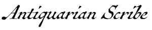
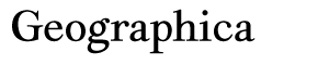
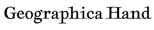
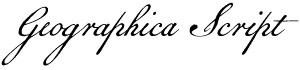
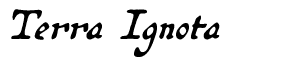
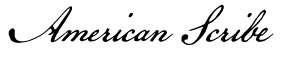
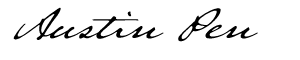
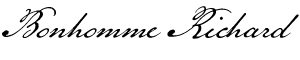
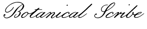
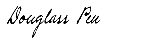
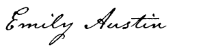
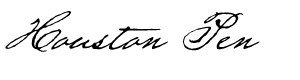
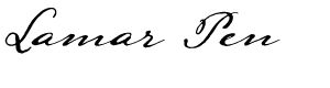
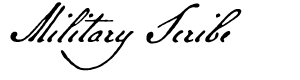
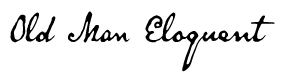
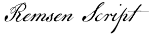
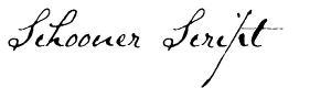
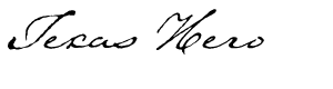
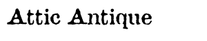
The text face used here (as well as elsewhere) is Broadsheet™. The home page letters are set in Emily Austin™ & Lamar Pen™. All typefaces referenced on this website— Abigail Adams™, American Scribe™, Antiquarian™, Antiquarian Scribe™, Attic Antique™, Austin Pen™, Bonhomme Richard™, Bonsai™, Botanical Scribe™, Broadsheet™, Castine™, Douglass Pen™, Emily Austin™, Geographica™, Geographica Hand™, Geographica Script™, Houston Pen™, Lamar Pen™, Military Scribe™, Old Man Eloquent™, Remsen Script™, Schooner Script™, Terra Ignota™ & Texas Hero™ (as well as all other fonts in the Handwritten History™ Bundle)—are the intellectual property of Three Islands Press (copyright ©1994–2015). For site licensing contact: Three Islands Press P.O. Box 1092 Rockport ME 04856 USA (207) 596-6768 info@oldfonts.com |
|
|
|
|
 |
|
|
|
|
 |
|
|
Archive for the ‘History’ Category
Sunday, November 13th, 2016
We’re not just losing handwriting: written communication generally is going away.
 Detail from the journal of Mirabeau B. Lamar (1835). I’ve mentioned here the little surge of emotion that comes when you recognize the writing of a loved one—or even, I suppose, the notes of a strict professor, or the scrawl of a stalker. In all cases, a lot more gets communicated by the slope of the letters, the look of the lines, than by the actual words and sentences themselves.
But imagine a world where those words and sentences themselves have gone missing. Imagine a virtual life in which everyone simply talks to each other, and any subtle hints to deeper meaning must come from the oldest nonverbal cues—tone of voice and facial expression. It’s where we seem to be headed in this digital age.
 Detail of 1407 Bible by Gerard Brils of Belgium. Thanks to smart devices, now within arm’s reach of most First World residents, the ease of capturing audio and video has increased a hundredfold. Podcasts are how we document change or predict the future, replacing magazine articles and newspaper columns. We listen to storytelling and standup comedy instead of going to the library to check out books to read. We’ve been suddenly thrust into a golden era of TV.
Never mind the loss of longhand—typing on a traditional keyboard has given way to hammering out txts and mssgs with just two thumbs. With autocorrect, who needs to learn how to spell? Heck, witness the sudden proliferation of emoji. Is it inconceivable that written literacy will, over not a very long time, diminish and fade?
 Calligraphic font Zapfino (1998), by Hermann Zapf. Maybe I’m being pessimistic—after all, my very livelihood depends on the written word—but consider the spread of this: “tl;dr.”
Short of an apocalyptic global catastrophe, I can think of no event that might reverse this slow extinction of reading and writing. Only if the grid goes down will we have to revert to lighting our own lamps, and making our own lampblack ink, sharpening our own quills, and pounding our own pulp into paper. I suppose that might be seen as a silver lining.
 Excerpt from the diary of my father, Leslie Willson. I’m drawn again to a page of my father’s diary—this one from 07 August 1945, the day after the bombing of Hiroshima, when he was a 22-year-old serviceman—written in his familiar cursive hand:
“I cannot conceive of any harnessed force so powerful. Although no mention was made of the actual damage done by this one bomb, its potential effect is tremendous. It may well shorten the war to weeks or days—and it may well have been the death rattle of this round green earth.”
Well, here we are more than 70 years later, and no planetary cataclysm has occurred. So it might be up to our human eye for art and history to preserve our lovely alphabets—the beauty of calligraphy, the magic of an ancient inscribed scroll. Current type design trends, in fact, seem full of fanciful scripts.
Nope, I cannot abandon hope. I can’t conceive of life without the written word.
Miscellanea
» Does the loss of cursive mean social devolution?
» Or have computers effectively taken the place of the pen?
» Have you ever noticed how your handwriting has changed over time? (Mine has.)
» Another argument why teaching handwriting to kids is a good thing.
» What do François Mitterrand and Steve Jobs have in common?
» More moving evidence of the timeless power of handwriting.
Tags: apocalypse, calligraphy, communication, cursive, diary, future, graphology, handwritten communication, handwritten letters, Hiroshima, historical handwriting, journal, keyboards, Leslie willson, literacy, nonverbal communication, nonverbal cues, off the grid, penmanship, podcasts, predictions, reading and writing, smart phones, storytelling, text messages, written communication, written literacy, written word, WWII, Zapfino
Posted in Calligraphy, Communication, Cursive, Graphology, History, Literacy, Longhand, Old Letters, Penmanship, Ruminations, Science, Specimens | 1 Comment »
Thursday, September 15th, 2016
 Amerique Septentrionale (detail). It all began with my fascination with old maps. Long before I’d even designed my first font, in fact, my parents had given me a collection of printed maps of Texas from the 1500s to the 1900s called Contours of Discovery.
I marveled at the hand-lettered legends and place names and how they differed over the centuries—and years later modeled Terra Ignota after the lettering on one of these prints, Amerique Septentrionale, by French cartographer Nicolas Sanson d’Abbeville.
 Cartographic work of Emanuel Bowen (detail). To date, I’ve released five typefaces inspired by maps and charts from the 17th through 19th centuries, most recently my first-ever serif text-type family, Geographica. My plan was to offer two kindred fonts—a script and a hand—that simulate the penmanship on Geographica’s source materials, the mid-1700s maps of English engravers Emanuel Bowen and Thomas Jefferys.
And in rounding out the character set for the first of these, Geographica Script, I stumbled on a fascinating phenomenon I’d never heard of: trade cards. In particular, British and Colonial American trade cards from the 1700s that, like cartographic prints from the period, demonstrated ornate 18th century penmanship.
 Trade card for Spermacaeti Candles (click for larger view). The precursors of modern business cards, trade cards were designed, engraved, and printed for tradesmen, service providers, and salespeople to distribute to potential customers as introductions to (or advertisements for) their particular businesses. Not only were these cards covered in fancy, graceful round hand, but they usually also featured opulent floral designs and period illustrations of products and popular symbols—like anchors, crowns, doves, and lions rampant.
As soon as I laid eyes on 18th century trade cards, Geographica Script got a lot more interesting: it’ll come with many such ornaments.
 William Hogarth illustration. A number of the images I found—in collections from such places as the British Museum, the Museum of London, and Yale’s Lewis Walpole Library—were the work of English printmaker William Hogarth, an artist and cartoonist credited with pioneering western sequential art. The prolific Hogarth was a master at reproducing the iconic symbols of the period.
And the round hand itself on these varied, intricate cards added a plethora of flourishes, swashes, and embellishments. Curls and loops, fancy ampersands. (My OpenType-features cup overfloweth.) Plus, I learned a few things, such as the meaning of the ubiquitous abbreviation “NB” (nota bene, or note well) and the fact that, as long as 250 years ago, we English speakers were fond of the phrase “all sorts of.”
Geographica Script is taking longer than I’d imagined, but I’m anxious to find out how it’s received. (There’ll even be a unicorn!) I dare not predict a release date, but keep your eyes peeled.
 Geographica Script unicorn rampant. * * *
A few trade card links:
• Trade cards at the British Museum
• Trade cards at the Museum of London
• Trade cards at the Fitzwilliam Museum
• Search the Lewis Walpole Digital Images Collection
• Trade cards on Pinterest
Miscellanea
» Do this: take five minutes to listen to this TED talk by Lakshmi Pratury on letter-writing. (Just do it.)
» Here’s a transcript of the Ted Radio Hour podcast about Laskhmi Pratury’s talk (and a link to the podcast).
» Civil War amputees helped by left-handed penmanship contests…
» …and Geneva, Ohio, students participate in a Spencerian handwriting contest.
» The power of cursive penmanship in the 21st century, in response to…
» …Anne Trubek’s opinion in the New York Times (that handwriting no longer matters).
» Japan’s prime minister wins praise for his handwriting’s “good-looking characters.”
Tags: 1700s, 18th century penmanship, antique cartography, antique penmanship, British Museum, Emanuel Bowen, Geographica Script, handwritten fonts, historical maps, historical script fonts, Lewis Walpole Library, lion rampant, Museum of London, old handwriting, round hand, Thomas Jeffreys, trade cards, unicorn rampant, vintage handwriting, William Hogarth
Posted in 1700s, 18th Century, Cursive, Historical Figures, History, Penmanship, Round Hand, Specimens | No Comments »
Sunday, June 5th, 2016
 Old Dutch and Malabar scripts. I have in my possession a book published in Amsterdam in 1672. Its author is Philippus Baldaeus, a Dutch Calvinist missionary, and my copy is written predominantly in German. It’s a big book, whose title (translated into English) is A True detailed description of the famous East Indian Coasts of Malabar and Coromandel, and the island of Ceylon.
Baldaeus accompanied Dutch invaders to southern India and Sri Lanka and came back with a tale to tell. This volume—which my father (Germanic languages professor and literary translator A. Leslie Willson) used in researching a book of his own*—has a number of magnificent plates and a series of pages showing samples of the glyphs and letterforms then used in the ancient written language of the residents of Malabar.
 Egyptian hieroglyphs (the British Museum). The scripts are truly beautiful—both the exotic Brahmic glyphs of Malabar and the looping Dutch script that accompanies it. And they serve as just one example of handwriting as art.
The earliest writers of course used pictographs, then hieroglyphs (pictures representing sounds), which could certainly be considered art. As might the illuminated manuscripts created by Medieval scribes—but that’s not what I mean. I mean handwritten symbols, Latin and otherwise, whose shapes or execution or both represent art in a fundamental way.
 Zapfino specimen. By its very definition, calligraphy is a fine example. The pleasing, expressive sweeps of a calligrapher’s brush or pen can be admired for long moments, can conjure up moods or memories or magic. Calligraphy spans multiple language systems and cultures. In fact, some of the most popular fonts these days are essentially digitized calligraphy—from Zapfino, by late master type designer Hermann Zapf, to the work of contemporary lettering artist Laura Worthington.
Sign painters, poster designers, and graffiti artists also qualify—their hand-rendered letters and words are an unquestionably sincere form of accessible artistic expression. (I’ve received some wonderfully illustrated envelopes from such folks, which I have displayed prominently here and there.)
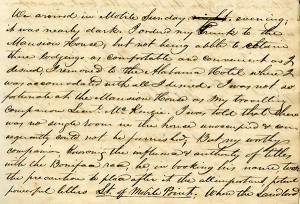 Detail from Mirabeau B. Lamar’s journal. But leave it to me to carry the handwriting-as-art concept into an even broader realm: the shared experience of people who have written (and, in declining numbers, still write) routinely by hand. Those who have unique or fancy signatures, or who add special little extra loops or curls or flourishes to their regular script (or printing), or who take secret pride in the shapes of their Ps and Qs.
I have a strong appreciation for this kind of handwriting artist’s work. I know it when I see it. I’ve seen it amid the source materials for the pen fonts I’ve made of the scripts of historical Texans—the sweep of the D of Mirabeau Lamar (Lamar Pen), the little vertical cross Emily Austin Perry added to her H (Emily Austin), Sam Houston’s inimitable signature (Houston Pen). Another such font I’ve got cookin’ in the oven adds an interesting twist: the script in Stephen F. Austin’s prison diary, originally written in pencil, was later traced in ink by his nephew, Moses Austin Bryan (Emily’s son).
 Detail from Stephen F. Austin’s prison diary. You’ve seen it, too, in the handwriting of certain friends or relatives. Perhaps they heard early on how neat their cursive was, so they took pains to make it more evocative. Perhaps they’re visual artists by nature, and it also carries over onto their notepads. Even sloppy scribblers have quirks curious and endearing. Witness the little crosses on the Zs of Viktorie.
Without question hand-done lettering communicates far more than mere words and sentences—e.g., the mind, age, mood, or proclivities of the writer. Perhaps, in this sort of innate expressiveness, all handwriting might stand as a form of art.
Note: If you know of an example of some particularly artistic penmanship, I’d love it if you’d comment with a link.
*A Mythical Image: The Ideal of India in German Romanticism (Duke University Press, 1964).
Miscellanea
» Award-winning penmanship doesn’t necessarily have anything to do with hands.
» And while were on the subject, here’s another young handwriting champion. Can there be hope for penmanship?
» Perhaps not, as some are editorializing against cursive requirement in schools.
» Meanwhile, archaeologists have uncovered 2,000-year-old handwritten documents in the London mud.
Tags: 18th century handwriting, antique penmanship, calligraphy, cursive script, embellished scripts, Emily Austin font, handwriting as art, hieroglyphs, Houston Pen font, illuminated manuscripts, Lamar Pen font, Leslie willson, neat handwriting messy handwriting, old Dutch script, old handwriting, old Malabar script, petroglyphs, Philippus Baldaeus, pictographs, Texas history, Viktorie font
Posted in Cursive, Graphology, History, Old Letters, Paleography, Penmanship, Ruminations, Specimens | No Comments »
|
|
|
|
|
|
|
|
|


